
 I foolishly thought this would be easy. Entries would consist of a bunch of broken ebooks and maybe there would be one standout to declare the winner. Instead, out of 13 entries, not a single broken ebook and so many standouts I nearly panicked. I had to nitpick on practically a molecular level in order to select a winner.
I did notice a few common problems. One with squishy line spacing, and the other with tables of contents. While all the ebooks responded to the Kindle user controls, ebooks that had been converted using Calibre had squished lines. I’ll address this issue in a later blog post. The other common problem was with the ToC entry not showing up in the Paperwhite Go To feature. I’ll discuss that in another blog post, too.
For now…
The winner is…


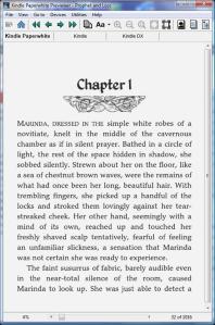
WINNER: The Picasso Problem
Author: Douglas Grant Johnson
Formatter: Douglas Grant Johnson
Size: 661k
“I begin with an html template from Suzanne Fyrie Parrott (Unruly Guides.com), then work in Sigil for the text editing to further modify the CSS and add other html touches such as first line small caps on the first paragraph after a scene change and to get up-caps on the first line of new chapters etc. This gives me an epub file ready for Nook and Kobo, then I use Kindlegen to convert to mobi for uploading to Amazon. So far, I’ve found it best to keep it simple. For example, some html commands work well on the actual Nook, and Kindle hardware, but will not work on the Amazon “look inside”. It seems good to test the job everywhere. I’ve also found it best to forget Calibre.”
TECHNICAL: Perfect.
NAVIGATION: The ToC is not listed in the Go To feature in the Paperwhite. There are multiple links at the beginning and end to give readers opportunities to connect.
EXTRAS: Professional looking front and back matter, including an excerpt for a novel. Good looking listing of other works. Missed an opportunity to offer live links to listings on Amazon.
OVERALL: Attention to detail makes this book a winner. Simple but elegant, and hits all the right notes for a book that looks like a pleasure to read. From the striking little graphics on the chapter heads to spaced ellipses to well-constructed first line treatments, it pulls together in a visually pleasing whole. My only recommendation would be to try pseudo-elements, which work great in Kindle books, and can’t be beat for first line treatments. Excellent job, Doug!
In no particular order, the other entries.
 Title: Prophet and Loss
Author: Jon Westcot
Formatter: Jon Westcot
Size: 895k
“Programs used: Initial layout was done with Sigil. Paint Shop Pro was used to scale and clean the graphics. Conversion to Amazon format was done with KindleGen.”
TECHNICAL: Perfect.
NAVIGATION: All links work as they should, and bonus points for linking to the cover artist’s websites.
EXTRAS: Very nice use of an embedded font and graphics for the chapter and section headers. Bonus for the funniest disclaimer in this month’s contest.
OVERALL: This is a beautifully formatted and professionally presented work with nice visual impact in the chapter headings. My only recommendation would be to add color to the graphics so they really pop on the Fire.
 Title: The Most Special Chosen of All
Author: Rachel Vega
Fomatter: Rachel Vega
Size: 3715k
“Initial Creation Software: Sigil
Conversion Software: Kindle Previewer”
TECHNICAL: Perfect.
NAVIGATION: No ToC listed in the Go To feature on the Paperwhite. Some places in the text have underlined text so it looks like links. But they go nowhere.
EXTRAS: Nice front and back matter, including an author photo. I recommend putting the summary on a page of its own.
OVERALL: While the ebook isn’t unreadable, it’s not quite there. Block paragraphs do not look good in fiction. Use curly quotes instead of straight quotes, and proper em dashes instead of floating en dashes. Do a more careful proofread, including your section titles.

 Title: Bone-Mend and Salt–Book 1 of Accidental Heretics series
Author: Annie Pearson writing as E.A. Stewart
Formatter: Annie Pearson
Size: 834k
“Word, saved as HTML filtered.
Manually tweak HTML <style> section.
Convert to Mobi via Calibre”
TECHNICAL: Line spacing squishy.
NAVIGATION: No ToC listed in the Go To feature on the Paperwhite. Nice ToC with chapter headings, and interesting section heads. Missed opportunity to have a link (and maybe a thumbnail of the cover) at the end of the preview for another title.
EXTRAS: Curious as to why there is an extra cover included. A nice touch is a short summary at the beginning that gives an overview of the story. Readers with huge TBR piles and poor memories will get the most benefit. A cast of characters separates the fictional from the actual characters. Nice touch.
OVERALL: Overall, a beautifully formatted book that looks great. From a reader’s perspective, very wise move on this author’s part to break up this meaty novel into parts with informative pages at the beginning of each section.

 Title: Keeping Secrets
Author: Maggie Dana
Formatter: Maggie Dana
Size: 554k
“Design path: MS Word, to a plain text editor (Text Edit/Mac), to HTML, where I seriously cleaned it up (I spent months and months learning HTML and CSS; Guido Henkel’s site was a huge help, plus I’d already designed my web site in Dreamweaver, so I had a little HTML experience from that. See http://www.maggiedana.com). The first ebook version I did (November 2011) was via Calibre and it worked fine, as did 4 more books in the series. Then a year later I discovered that Amazon was rejecting files created with Calibre, so I bit the bullet and learned SIGIL. I promptly redid all my books with SIGIL OK, that worked great for ePubs and actually passed Apple’s stringent requirements, but what about Mobi? So I downloaded the Kindle Previewer and Kindlegen and produced the Mobi files through that. If there’s a better way, I’d love to learn it (I may beg help from you on this at some point!). So my MOBI path is: MS Word, Text Edit, HTML/CSS, Sigil, Kindle Previewer/Kindlegen…As a print typesetter, I love drop caps, initial caps, and a classy-looking dingbat for a chapter opener. But older Kindles choke on this stuff, so I took off my print designer’s hat and went with a vanilla ebook design.”
TECHNICAL: Perfect
NAVIGATION: The ToC doesn’t show up in the Go To feature on the Paperwhite.
EXTRAS: Clever touch to put a link to the series on the title page.
OVERALL: A nice looking ebook, looks professional throughout. My only recommendation would be to split the page after The End and make an entry in the ToC for “Other Works. I’ll disagree about older Kindles choking on the fancy bits. This book calls out for at least a few. Some graphics in the chapter heads, maybe even a photograph or two of beautiful horses.

 Title: Death and Magic
Author: Steven J. Pemberton
Formatter: Steven J. Pemberton
Size: 605k
“I formatted it myself. I wrote the book in a text editor and used a very simple program I wrote to generate HTML from it, which I then fed into Calibre to produce the .mobi.
(And yes, I read your previous blog post where you said not to use Calibre. Is it a bad idea because of all the cruft that MS Word puts into its HTML export, or is it a bad idea generally? My HTML specifies as little of the formatting as possible, so that – in theory – the reader’s device will use whatever settings the reader has chosen. I wonder if any reading devices allow the reader to override the formatting in the book, to get around really bad formatting? If not, why not? I suppose they shouldn’t encourage writers to think that the reader can fix it himself if he’s not happy with how it looks…)”
TECHNICAL: Squishy line spacing.
NAVIGATION: The ToC doesn’t show up in the Go To feature on the Paperwhite.
EXTRAS: Includes a nice acknowledgements page and About the Author page, along with an excerpt with links.
OVERALL: An attractive, nicely laid out ebook. There’s some ‘lag’ when ‘turning pages’ which indicates a bloated file, even though the file size is not unreasonable. Splitting the files might help. I’d recommend closing up the em dashes–letting them ‘float’ causes odd spacing at times. Other than that, it looks professional.

 Title: Doc Wilde and the Frogs of Doom
Author: Tim Byrd
Formatter: Gary Chaloner
Size: 7843k
“Formatted by Gary Chaloner using InDesign.”
TECHNICAL: Perfect.
NAVIGATION: No ToC. With 61 chapters and many illustrations, this ebook would have benefited from both a short and long ToC.
EXTRAS: The front and back matter are informative, but I dislike centered blocks of text. It looks amateurish and out of place in an otherwise professional book. Lots of links and an excerpt and sell points. A nice touch to put the Kickstarter appreciation pages in.
OVERALL: This is a good looking book–the illustrations are wonderful! (I would love to see them in color on the Fire) It does have some problems. Drop caps are a good idea in theory, but they just don’t work well across the board. The look kind of okay in the Paperwhite and Fire, but in the Keyboard they are so misaligned they don’t seem part of the text. Also, the first line all-caps are inconsistent. Even though pseudo-elements work inconsistently in EPUB formats, they work great in MOBI files. Use them for first lines and you’ll retain better control over the opening paragraphs. I’d recommend, too, increasing the paragraph indent. I’d also recommend tables for the Kickstarter acknowledgements. Pages of centered names aren’t horrid, but it would look so much better in table format.

 Title: The Ranch Next Door and Other Stories
Author: Elisabeth Grace Foley
Formatter: Elisabeth Grace Foley
Size: 713k
“I did the formatting myself—I created an HTML file in Notepad++ and used Calibre to convert it into multiple formats, following Guido Henkel’s superb online guide.”
TECHNICAL: Line spacing squishy.
NAVIGATION: No ToC listed in the Go To feature in the Paperwhite.
EXTRAS: The front and back matter are nicely done, except for the blocks of centered text in the copyright page and dedication. Live links for the credits would be a nice touch. For the links that are live, don’t list the http part of the url.
OVERALL: Nicely formatted, looks professional and clean.

 Title: Struck by You
Author: Marvin Petitjean
Formatter: Marvin Petitjean
Size: 380k
“Name of programs used to format and convert book:
Sigil + Calibre”
TECHNICAL: Line spacing squishy.
NAVIGATION: No ToC listed in the Go To feature in the Paperwhite.
EXTRAS: A three line bit at the end that is more confusing than inviting.
OVERALL: While the text looks clean and professionally written, the impression of this ebook is that of a raw manuscript loaded onto the Kindle for proofreading. Extra wide paragraph indents, lack of scene break indicators, blocks of centered text and not even a The End make the ebook look unfinished. Aside from the fact that the special character used as an ornament in the chapter headings translated inconsistently, using the abbreviation “chptr” looks wrong. My recommendation would be to make more effort to engage readers and take advantage of the emotional connection roused by the story to sell yourself, the author.

 Title: The Drowning
Author: Richard Herley
Formatter: Richard Herley
Size: 567k
“I formatted it using JEdit (a text editor with really neat XML/HTML tools), then ran it through calibre to make the .mobi. In this I was helped a great deal by Paul Salvette’s How to Format Your eBook.”
TECHNICAL: Squishy line spacing.
NAVIGATION: The ToC doesn’t show up in the Go To feature on the Paperwhite. A very nice ToC, though, so I was a bit disappointed that the terrific chapter titles in the ToC did not appear in the actual chapter heads.
EXTRAS: Nice layout, and an interesting author page. Includes nice synopses and reviews for other works, but missed an opportunity to put links in for those. (Readers do use those!)
OVERALL: A nice looking book, professionally executed. I’d recommend using proper em dashes instead of floating en dashes, which can sometimes look like mistakes instead of punctuation.

 Title: To Carry the Horn
Author: Karen Myers
Formatter: Karen Myers
Size: 1307k
“I created it from a scrubbed tagged text file (originating in Scrivener) which I converted to HTML using JEDIT following style guidelines from several websites. I read the HTML file into Calibre and used its conversion plugins (and defaults) to generate the MOBI file. I believe in the “Short TOC in front, long TOC in back” approach. I thought initial caps, drop caps, etc., starts to chapters would be too prone to breakage and restricted myself to small graphic elements for scene/chapter/end-of-main-text/start-of-marketing dividers. (Note the echo of the red deer antlers on the text cover page vs the final page of the index). I would greatly appreciate hearing about any outright errors or general design shortcomings you uncover.”
TECHNICAL: Squishy line spacing
NAVIGATION: ++Bonus points for including a short and long ToC, which include links back to the ToC for easy navigation. Minus points for blown formatting when a link is toggled.
EXTRAS: Excellent promotional pages including links on every page, an invitation to sign up for a newsletter, invitation to report errors, an excerpt for another work, a pronunciation guide and other niceties for readers.
OVERALL: A gorgeous book with handsome graphics. Visually, a pleasure. Producers interested in how to include front and back matter in an attractive and inviting way, would do well to study what Myers has done. My suggestion: Use KindleGen to convert the book (and avoid the squishy lines) and fix the links from the ToC to the chapter heads, and this would be a perfectly formatted ebook.

 Title: Vokhtah
Author: A.C. Flory
Formatter: A.C. Flory
Size: 347k
“I’m very much a DIY author, so although I don’t expect to win, I am hoping to find the areas where the format of my ebook is below standard. Programs : StoryBox 1.5 for the writing and epub/mobi conversion. Calibre to convert .mobi to Kindle compatible file [to check output on my Kindle].”
TECHNICAL: Squishy line spacing.
NAVIGATION: The ToC doesn’t appear in the Go To feature in the Paperwhite. A nice looking ToC though, with chapter titles that avoid the Chap 1, Chap 2, etc. tedium. Unfortunately, the links go to the wrong chapters. In the toc.ncx (the Go To feature) there are listings for “New Documents” and the title is listed as VOKHTAH for Linda.
EXTRAS: A pronunciation guide! A dictionary! Very nice touch for the readers. The thank you page has a link to a webpage spelled out, but it isn’t live.
OVERALL: There are a few extra lines throughout that could be scene breaks or could be mistakes. (if scene breaks, use some kind of indicator; if mistakes, check for extra spaces at the ends of paragraphs) I’d recommend using proper em dashes instead of floating hyphens.

 Title: Your Life With Rheumatoid Arthritis
Author: Lene Andersen
Formatter: David Govoni
Size: 1839k
“We used Scrivener and the standard Amazon Kindle converting program to format and convert the file. The name of the formatter is David Govoni.”
TECHNICAL: Perfect.
NAVIGATION: No ToC listed in the Go To feature in the Paperwhite. No internal links for the endnotes. The ToC has clearly named titles listed. Very important in a non-fiction.
EXTRAS: Credits with live links for editors, cover designers and others. Nice. Blocks of centered text, not so nice. The endnotes are put together well with plenty of links to useful websites. The use of superscript numbers is distracting, though, and makes the text appear misaligned. They do need links because there is no way for readers to reference back to the text. I’d recommend, in the very least, breaking up the endnotes by chapter.
OVERALL: While the book is laid out with solid structure, there are some details that make it look less than professional. Straight quotes instead of curly quotes, no scene break indicators, the paragraph indents border on too narrow, and floating em dashes. The bulleted lists look misaligned.
 I want to thank everybody who entered. You put together some terrific looking ebooks and done yourself, and indies everywhere, proud. The BPHs could learn plenty from you.
Click on the covers to see any of the above ebooks at Amazon.

Thanks for creating this award! You put a lot of work into it and it shows in your thoughtful comments. We’ll use them for reference for the next book. You made an interesting point about straight vs. curly quotes – I use Dragon NaturallySpeaking to write and to my knowledge, it offers only the straight quote option. However, it’ll be an easy find/replace task for my editor in the future. 😉
Thanks again!
Hi Lene, straight quotes can cause unintended errors, which makes them dangerous in an ebook (though Kindles handle them better than do EPUB readers). Thank you for entering the contest.
Jaye, thanks for your (too-) kind word about my submission. Moreover, thanks for creating this award! I truly hope it helps raise the level of quality for all e-books.
It was interesting to see how many entrants used Sigil. And it was a little disheartening to see how many used Calibre for their MOBI conversion.
One suggestion: It would be nice to know if any of the other entrants, for this month or any subsequent months, are willing to share their knowledge with others who are still learning the ins and outs of formatting. I know I’m always willing to help if I can and if I have the time.
Can’t wait to see the entries in the future!
Cool chapter ornaments, Jon.
Hi Jon, I really do like your ebook. Love that font. I am going to start campaigning for an alternative to Calibre. I knew it was screwing things up, but I kept seeing the same exact problem, it’s proof to me that the people formatting aren’t doing anything to mess up their ebooks–the problem is inherent to Calibre.
Judging was really hard. It practically came down to coin flipping. Whew.
Wow, what a great bunch of submissions! Congrats to Doug.
🙂
Jaye:
This is a fabulous idea and I hope you continue with it (warning: you will be swamped!!!) I appreciate your kind comments on my entry and would love to learn how to a small graphic in the chapter heads that won’t show up with a white background if readers change to sepia or black.
Any ideas?
I don’t think jpg and gif allow a transparent background, but I could be hopelessly out of date, here. I would also like to refresh my memory about your excellent tutorial on creating caps/small caps. Can you provide a link?
JPG does not; GIF and PNG both allow for transparency (they didn’t show the transparency in the .mobi when I’ve tried, though I have seen it work).
Like pbny, I have seen it done, I have yet to figure out how. I’m going to figure out how (it’s probably something really simple that’ll make me facepalm and go, “d’oh!”) That said, I don’t think the non-transparent background annoyance outweighs the benefits of graphic touches and illustrations.
Trust me, Maggie, when I figure it out, I’ll shout it.
Jaye, while William’s method for generating transparent images is sound, I’m wondering if there is an alternate way. Some weeks back, you posted code samples for switching between gray scale and color images based on the device type. I’m wondering if there might be a similar extension provided by Amazon to allow one to alter provided content based on the setting of day, night, or sepia. Of course, this would require several sets of images, and it wouldn’t address the issue of solving this for an ePub file, but it might be interesting to see if it worked nonetheless. Who knows? The setting may be a general one, too. Just a thought.
Typo alert: should be … “how to INSERT a small graphic …”
Congratulations to you Jaye for taking the time and effort to put this together and double congrats to all those not afraid to have entered the chasm of the Obsessinator
SOme interesting looking books there that may warrant a look xxx
Definitely, Tom. Definitely. I’d put any of the entrants up against the big publishing house ebooks any day.
On the Kindle, there are two ways to get a graphic with a transparent background. The most common way is to use an SVG file. I use a command line program called potrace (with mkbitmap) to convert JPEGs or GIFs into SVG format. You will need to include the original file for use on devices that use the old .mobi format (Kindle 1, DX, 2 and iOS). The other way to accomplish this is to use a truetype font which contains the image as a glyph. If that sentence didn’t make sense to you, stick with the first option. You will need a fallback image for the old .mobi formats.
To get your TOC to show up in the “Go to” menu on the e-ink Kindles, you need to put a “guide” section at the end of your content.opf file (right before the closing tag of the package. Like below, but with angle brackets instead of square brackets:
[guide]
[reference type=’toc’ title=’Contents’ href=’/wherever/toc.xhtml’ /]
[reference type=’text’ href=’/wherever/chapter1.xhtml’ /]
[/guide]
[/package]
That second entry will help Amazon put the start reading location at the right place, so it should point to chapter 1 (or a prologue if you have one).
Okay, William! I am going to have to check out the svg images. I have seen it done and going a little crazy trying to do it myself.
I’ll be doing a blog post later this week about ToCs and making sure they show up in the Go To. I’m not sure why the Paperwhite isn’t picking up the ToC automatically the way the Keyboard does. It stopped doing that in the latest update, and they pulled a bit of a nasty on the Fire, too. They are important changes and producers need to be aware of them.
Jaye,
I am not sure I understand what you mean. Can you load one of these books up in the previewer and select View | Book Information from the menu (or just press Ctrl-I)? Every book I’ve tested that says “Table of Contents – Specified” in that pop-up has the “Go to…” “Table of Contents” option enabled on my Kindle Keyboard. I have assumed that the same would be true for a PaperWhite.
You need a donate button – and an indication of which ereaders you have. That way we could help you buy the ones you don’t have, so you can test things out.
Beautiful job of analyzing the entries – your comments will make the next generation even harder to judge!
Thanks, ABE. We’ll keep raising the bar–and device makers will keep changing things and making us all crazy again! 😀
Jaye, thanks for considering my book and for the advice about the en-dashes and calibre. Sigil is obviously the next piece of software for me to learn! Apropos the chapter titles, I only ever put them in the TOC, and they’re simply a memory-jogger for anyone who’s already read the book and wants to find a particular scene.
Thanks for entering, Richard. I LOVE chapter titles–they make so much sense in ebooks. Especially the way I read. 😀
Chapter titles in fiction are one more tiny place to put a piece of atmosphere – I work hard to find appropriate bits and quotations. I hope they will help someone remember where they were, or something they particularly liked.
Jaye, thank you for your comments! (I’m just catching up with this post; somehow it slipped my mind until now!)
I created this ebook back when I only had a Kindle Keyboard – and when I got a Paperwhite, I found the TOCs of many other books besides mine didn’t show up in the ‘Go To’, so I assumed it was a Paperwhite issue. I’ll definitely be interested in a work-around for that. I’m a little confused about the solution William offered above – how do you edit an OPF file? I’ve never even understood what that was; it just appears automatically in the folder I save my converted ebook to.
I have noticed the same thing, Elisabeth, and it’s getting worse. I don’t know why conversion isn’t recognizing the Toc–I know it knows it’s there because the menu button on the Keyboard is active, but the ToC isn’t showing up in the tocncx (internal ToC) on the Paperwhite. (It was getting the navigation tools right that sent me on the path to building my ebooks from the ground up–I need that control!)
To fix the opf, one either needs to build it from scratch OR take your existing EPUB file and open it in a program such as Sigil and fix the opf (that’s the content/guide file).
Something just occurred to me. The conversion programs are built to recognize certain words and styling. Did you designate the Table of Contents as h1 or heading 1? I need to try that and see if THAT is the fix people need.
This is amazing! You are all amazing! Jaye, so brave and generous of you!
Thank you, Julia! 😀
Pingback: Perkunas Press
Pingback: Ebook formatting with Sigil (for the control freak) | Hollow Lands