Hi guys. I’ve been neglecting the blog lately. But I’ve been thinking about you while learning new ways to make ebooks look even more fabulous.
But! Before we go further, I HAVE to show off Plunderbunny’s latest cover creation. (She and I are working together on a huge project, and she created a cover I just love.)
 She used an old photograph of a Lakota Sun Dance ceremony (supplied by the author) and an image of a necklace and medicine wheel (made by the author) to create a striking cover for the ebook. I think Spirituality for America turned out great.
Designing the interior was my job. Part of the challenge for this project was that it contained excerpts, quotes, footnotes, notes by the author, and images with captions. I designed the ebook with tablets in mind (especially given that it also contains lots of hyperlinks to sources on the ‘net). That means color comes into play. The big challenge was finding graceful ways to set off text. Goal: Make it stand out, look good and be readable across all devices.
IMAGE CAPTIONS
Lots of ways to caption images. One way is to marry the caption with the image itself. The big plus with this is that the image and caption never get separated. The big downside is that depending on the size screen the reader is reading on, the caption (because it is an image) can become distorted or too small to read.
Because some of the images had largish captions, I decided to make them all part of the text.*
 This image had a short caption. I thought it was set off nicely by centering the text and styling it with small caps (font-variant: smallcaps**). Some of the captions were a little long for centered text (I don’t like having one or two words sitting centered on a line themselves) so in those cases I went with a block paragraph style.
 A few of the captions were really long. Since small caps are better in small doses and I didn’t want the block of text mistaken for anything except a caption, I chose to reduce the text to 80% and set it like a quote. The beauty of this is (unlike a caption embedded in the image itself) if the user has trouble with the smaller font, they can increase it.
FOOTNOTES
I used the same device for footnotes within the body of the text.
 It is possible to embed footnotes in ebooks so that a tap by the user causes a “pop-up” to display, but otherwise the footnote is “hidden.” (If you’re interested in reading more about it, check out Paul Salvette’s blog at bbebooks.com) Because this is a Kindle book and that tricky trick doesn’t work on every Kindle version, I went with setting off the text with 80% font-size and set off like a quote. One decision I struggled with was where, exactly, to place footnotes. There is no “footer” area in an ebook. One option was to link the footnote and place it at the end of the chapter. That would actually be an excellent option in many cases, especially if the text contains a LOT of footnotes. In this case, though, because there weren’t that many, I went with placing them at the end of the paragraphs which were noted.
NOTES AND EXCERPTS
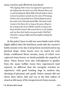
This book also contained several “Author Notes” rather like sidebars in a magazine article. The author wanted them placed within the text instead of in the “notes” section at the back of the book (containing references and the bibliography). There are also excerpts from other writers and works. I could have done regular block quotes and italics. I don’t know about the rest of you, but too much italicizing in an ebook is fatiguing to read (especially on my older Kindle which doesn’t have the best fonts). So I decided to go with a “box and shadow.”
 This is where I really had to behave myself. A couple of weeks ago I read David Wong’s novel, This Book Is Full Of Spiders. It is one of the most beautifully formatted ebooks in fiction that I have seen. It was so lovely, I loaded it on my Fire to read it (I usually read on my Paperwhite) just to enjoy the full visual experience. One of the devices the formatter used was to set off “book excerpts” in a box and shadow, using a colored background. It inspired me. Turns out it is not difficult at all to do.
 All it requires is to border the block of text and give it a background color. (I learned this from Paul Salvette’s formatting guide, check the sidebar on this blog) The css styling I used for the notes and excerpts was:
div.excerpt
{
margin: 0;
padding: 12px 12px 0 6px;
background-color: #FFDEAD;
border: 2px solid black;
}
Now when I said I had to behave, I meant the color choice. (I still haven’t figured out how to get a screenshot off the Fire, so a photo of the screen will have to suffice) Tablets support a LOT of colors and when you code in html you can pick from many. I had to seriously resist neon pink or day-glo green, instead choosing a light buckskin color that is easy on the eyes, goes with the theme of the book, and best of all, adds the right touch of shading to eink displays without making the text difficult to read.
 This ebook was a challenge, but it was an interesting challenge and that’s the kind I like best. I would love to hear from the rest of you how you found good ways to set off text in your ebooks. Share, people!
* Books is books, ebooks is ebooks, and they’re growing apart faster than most can keep up with. I no longer try to emulate “print” in ebooks for two reasons. Number one, trying to emulate a printed book is a frustrating exercise and the best result you can expect is to create an “ugly cousin.” Number two (and most importantly) ebooks have features and interface capabilities most ebook formatters are barely touching. As a reader I love being able to adjust the display to suit my preferences. On my tablet (a Kindle Fire) I enjoy having the ‘net instantly available with a tap of my finger. Nothing bugs me more than an ebook that has been forced into a nearly static display in a vain attempt to make it look like print.
**Small caps. I love small caps. I think they are elegant, show off text better than bolding, and just plain look good. Unfortunately, they don’t display on every device. So in cases where I think text with upper and lower case will work just as well (and the goal is purely aesthetic) I will use “font-variant: smallcaps.” Sometimes, such as at the beginnings of chapters or scenes, where I definitely want the text in all caps no matter what, but do not want the display to look oversized and chunky, I do “faux-caps.” I upper-case the block of text, then set the font-size to 80%. It looks nice no matter what device it’s being read on.

I want that color shadow thingie in my next book! That looks so pretty! You’ve done a fantastic job with Spirituality in America. It’s a gorgeous book!
Oh the temptations, Julia, the many many temptations….
And thank you, re SiA. I am pleased with how it turned out.
As you probably know, my sweet Jaye, I like C J Box and his Joe Pickett series of novels about a Wyoming Game Warden and I like the way he uses graphics at the beginning of each chapter in some of his ebooks, I am being won round having been somewhat ambivalent to these things since getting my Kindle
Everybody is on a learning curve, Tom. I think ebook producers are getting better overall and that the majority feels as I do, let print be print, and let’s concentrate on making the best looking, best functioning ebooks we can make.
This is so interesting and useful! I am currently working on a book that has short epigraphs at the beginning of each chapter. How would you handle those?
Set them off as blockquotes. Maybe decorate them with a line or a simple glyph. One thing I’ve learned about block quotes, it works best if you left-align the text instead of having it justified. Short quotes can get positively mangled by justification.
Oh! Good point about the justification.
Text alignment is a nifty tool. All my Kindles handle it nicely. i use “text-align: right” when I want to “sign” a letter or add an attribute to a quote. I just use the same css styling as I do for the quote, but tell it to align right instead of left.
I CAUTION people using Word to NOT mess with text alignment. If you justify text or set right alignment, Word will insert some nasty code that overrides some of the user-device features such as margins and line spacing. Set your Normal style to left align and leave it alone. The Kindle converter knows how to handle that.
This is a handsome ebook you’re working on, and some of the formatting looks quite daunting! I’ve just emailed you about this.
Actually, the coding was quite simple (or simplistic, depends on who you talk to). The most difficult part of this particular book was figuring out the layout. I spent a lot of time playing “eye-doctor.” Does this look better? Does this? First? Second? First? Second?
For ebooks, I like epigraphs set in a narrow column (roughly 30% of the normal width). You can put that column against the left or right margin or center it, depending on the rest of your chapter heading layout. Of course, I would also add soft hyphens to ensure that the lines are all fairly well balanced.
Okay, Sir William of Ockham, spill. Tell us about soft-hyphens.