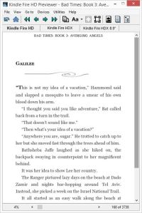
First, I’m not a fan of embedding fonts in ebooks. It’s simple to do, but it’s a minefield. Not every device will support embedded fonts, some fonts have very restrictive conditions of use, others can cost big bucks for a license, and some are not complete (as in, you can get the regular font, but not italics or many of the special characters such as em dashes or acute or grave marks). Making everything behave, and doing so in legal compliance, is far more hassle than it’s worth. My opinion. And for those of you using Word to format your Kindle files, do not let Word lull you into thinking all is well because your formatted Word file looks good with your fancy fonts. It can turn into a royal mess–and let’s not get into how much bloat the file will contain!–and you can even break the ebook so the user cannot change fonts or margins. Your file will convert just fine if you stick to Times New Roman or Garamond. The conversion programs recognize those.
That said, it’s okay to mix things up a bit by taking advantage of the capabilities already built in to the ereading devices. (I’m going to focus on Kindles because I own Kindles, but most of this applies also to EPUB devices.) Kindles offer a menu of font families in the user preferences. The Fire tablet offers four serif fonts (Caecilia, Georgia, Palatino, and Baskerville) and a sans serif font (Helvetica). Paperwhites have six fonts (serif, Caecilia, Caecilia Condensed, Baskerville, and Palatino; and sans serif, Futura and Helvetica). Even the older models offer readers a choice between serif and sans serif. You can mix them up.
 In css styling, it’s easy as can be. Insert this line in your style declaration:
font-family: “Helvetica: , “Futura” , “sans serif” ;
What happens is this, the device will use Helvetica, if it has it, or Futura, if it has it, but if not, it will use whatever sans serif font it has available. This is a nice touch for chapter titles and, as in the example above, a sign, or a headline, or to set off such things as text messages or computer readouts. You can customize the look further by using all caps, small caps, increasing or decreasing the font size, bold and italics. Best of all, it will not bloat the file, cause legal problems or interfere with the user controls.
* * *
Let’s move on to images–a subject that reduces many formatters to gibbering cuss-buckets. I’ll leave such things as sizing, text wrapping, fixing images, etc. for another day. Let’s talk about the dreaded WHITE BOX. You know what I mean. You have a nice little glyph or scene break separator that adds a touch of oomph to your ebook and it looks beautiful on the Kindle screen.
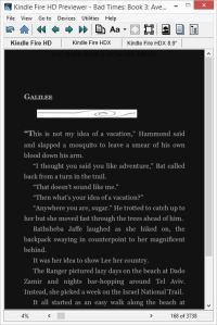
And then a user decides to read with a sepia background or in Night mode. And even though your image has a transparent background, this happens.
WHITE BOX.
I know of some users who prefer to use Night mode on their tablets. I, myself, will use Sepia when I’m reading long form at night when my eyes are tired. I barely notice the white boxes anymore, and I’m sure users of Night mode are pretty much the same way. It’s a quirk to get used to. As a formatter it drives me nuts. Especially since I own an ebook that has defeated the White Box problem, so I knew it could be done. I finally figured it out.

 Kindles will render three types of image files: jpeg, gif and png. Each has their strengths and each has their weaknesses: namely image crispness and file size. The trick to defeating the white box is the gif image. In Paint.net, the program I use for making simple graphics, when I save a gif image there is an option to adjust the transparency. I set it at 255. What that does is, everything with a resolution less than “normal”, i.e. 255, is transparent. (I should be able to do this with png images, but I haven’t been able to. So, dear readers, if any of you have figured it out, let us know.)
You do need to be careful with gif images. If they are too big they will get a distorted, fuzzy look. Not every color renders well. You should use a simple palette. Don’t use percentages so they adjust to the screen size–that can go bad quickly. Instead declare the width. Solid black images can disappear in Night mode, but if you give your image a narrow stroke of 1-3 pixels in white or pale yellow, that will take care of that.
So there you go, two more ways to improve the look of your ebooks and make them stand out.
Examples are from:
BAD TIMES 3: AVENGING ANGELS, by Chuck Dixon
BOURBONS & BLONDES, by Anthony Venutolo


I knew you would figure it out – in time for me to use it. Thanks, Jaye – now all I have to do is figure out how to follow instructions. One more for the list.
Seems to me a good question to ask someone who offers to do formatting, paid or not: show me you can do this. It would separate the truly competent from the rest.
Can’t be too hard on the formatters. The hardware innovations and the software updates often cause strange behavior in ebooks. I spend a LOT of time researching on the internet and experimenting with styling, and sometimes I find something that works beautifully, but only for a while. Amazon will do a Kindle update and things change. Sometimes what seems like the most basic of things that should work and even Amazon’s guide say should work, don’t work (though they have worked at one time).
This puts the DIY writer/publisher at a distinct disadvantage. Many of the how-to books available now are outdated. If one is only formatting an ebook every few months or once a year, then what they learned how to do before can be obsolete now. I have no idea how long it will take before this all settles down and formatting is truly standardized. I hope it is soon.
Of course I’m useless. But I do think you’re amazing. The post reminds me of Sheldon Cooper’s Fun With Flags. 😉
Heh.
Font Squirrel has a pretty good selection of fonts that can be embedded in eBooks. Anything with an SIL (or that is freeware) is good to embed without running into any legal troubles.
Hi Paul, I had you in mind while writing this, you who actually read in Night mode. 😀
I agree, fontsquirrel is excellent. I’ve discovered some wonderful font designers via that site. I also like dafont.com, BUT, read those licensing agreements carefully.
As long as we’re talking about fonts, people need to be careful about using dingbats and webdings, too. Users who turn off the publisher font might see an odd character or worse, a black diamond of doom, instead of the charming glyph the formatter intended.
Oh, another warning to DYI writer/publishers, if you embed a font and you get a WARNING during conversion, pay heed. Some off-brand fonts can actually break the ebook.
Yeah, me and my stupid Night mode, LOL. Making trouble for formatters.
Because of you and Night mode, I figured out a way to make sure my horizontal rules display properly, even in Night mode. You probably already know this, but it took me a while before the duh moment hit: set the border color as white. That way, even if I’m using a dark color or black, the line still pops in Night mode.
Your post could not have been more timely! I just sat down to format a book, for the first time experimenting with graphics for the scene breaks. I totally didn’t think about the white boxes! The artist sent over a gif based on the transparency you suggested. Fingers crossed!
It’ll be beautiful, Shelton. Most ereading devices display graphics very nicely (there are exceptions, but few, fortunately). Sometimes you have to tinker to get the results you want. But you can make it happen.
Does the Kindle support alpha transparency for PNGs?
Some sources say it does–others say it doesn’t. I think it can be done, but darned if I can figure out how. I’d prefer png images over gif. Sharper and more stable on shifting screen sizes. If my usual method of randomly clicking until something works comes up with a replicable result, I’ll be sure to let everyone know. 😀
Thanks, that would help with the background color problem.
“Does the Kindle support alpha transparency for PNGs?” – No 😦
iBooks supports the transparency though.
Oh man, don’t be playin’ Dougie Downer, Paul. Sigh… There must be a way to fool our machine overlords. That is my quest.
Speaking of which, I’ve been going nuts here lately trying to get captions to lock with images. Other than putting the caption in the image file, no dice. Kindles will NOT honor the keep commands. Any suggestions?
And as long as you are here, what about that pop-up function for footnotes on the new Kindle Voyager? I haven’t dug deeply into that yet, but suspect you have. Any ideas about how that works?
Haven’t had much luck locking images with captions. You can start them in a new html file so they start on a fresh page for the bigger ones. You can adjust with height: 85% or something so that it will leave some breathing room with the captions. I didn’t know there was a pop-up function for footnotes for the new Voyager. There’s been one for iBooks for a while, but it’s pretty buggy. If you have a lot of footnotes the device will crash out (at least my ancient iPad 2) does. There isn’t anything per se in the EPUB spec about pop-up footnotes but it’s a cool idea. Where did you hear about these pop-up footnotes for Voyager? I’d like to check it out.
Go here, http://www.amazon.com/dp/B00IOY8XWQ/ scroll down to “…and goes beyond the book” then click on “in-line footnotes.” I haven’t had time to do any in-depth research yet, but I intend to. Endnotes are okay and I’ve come up with a nice way to integrate them smoothly and make navigating back and forth relatively seamless. But… pop up footnotes!
I’m seriously annoyed with the image thing. It shouldn’t be that difficult. Grumble grumble.
Interesting. I wonder how it is supposed to be encoded.
Not a clue (so far). My big question will be: Can this be done WITHOUT breaking the ebook on other devices? I’ll be putting my order in soon for the Voyager. Can’t wait to run it through its paces and see what it can do.
Pingback: Self-Publishing Quick-Guide (And Resources) | The L. Palmer Chronicles