Amazon’s Kindle Create for Ebooks

Have you heard about Kindle Create from Amazon? It’s a free service for self-publishers to format ebooks and print books to sell on Amazon. It will accept a Word .doc or .docx file and allow the publisher to create a “custom” ebook.

I’ve been fiddling around with it for a while, trying to figure out the best, easiest ways to use the program. There are things about it I like; and things I dislike thoroughly. So first, the pros and cons (in my rarely humble opinion):

PROS
  • Relatively intuitive and user friendly (an 8 out of 10 for ease of use)
  • Allows for some customization
  • Foolproof as far as creating a functioning ebook
  • Help pages are readily available (I give them a 6 out of 10 for usefulness)
CONS
  • It’s a proprietary format that can only be used on Amazon (Big consideration, given that you cannot use your formatted ebook for any purpose other than selling on Amazon. You will have to format an EPUB for other retailers.)
  • Themes are clunky (I don’t think a book designer had a hand in creating the styles. The results aren’t awful, but they don’t look very sophisticated either.)
  • Making batch changes is not possible (that I can figure out)
  • There is a Find function, but no Replace function
  • Uses page view only, rather than an adjustable Web layout view
  • Cannot edit with the Previewer open (Makes proofreading even more tedious.)

Before You Begin

As with any type of format, it’s Garbage In, Garbage Out. Your source document must be in tip-top shape–edited, polished, proofread–and as clean as you can make it against unwanted coding. (I’ve written extensively in this blog about the importance of a clean source doc and how to efficiently get it into shape.) I tried different levels of styling to see what the program will accept and what it won’t. I found that the best way is, in Word, to set up the body text or Normal style as if the doc is formatted for an ebook, but to leave the headings, front matter and back matter unstyled. Place all front and back matter in the order you want for the finished book. (And big pro, don’t worry about the table of contents–Kindle Create will generate it for you.) I also used tags to note where I want page breaks, scene breaks, and special paragraphs (the tags serve as search terms).

Above is a clean doc, styled in Normal, with Heading 1 applied for my own purposes in Word. Kindle Create doesn’t appear to recognize heading styles. And notice, no page or section breaks.

If you want to link to other works (Amazon listings only), your website, blog, social media or Amazon Author Page, create the links in the Word document. (All the hyperlinks I created in the Word doc worked just fine in the KC program.)

Step by Step in Kindle Create

1. When you first open the program a box will appear that asks you what type of project you are creating, and the language (the program supports a multitude of languages).

2. Next, open a Word .doc or .docx file. It will be converted. (If the conversion isn’t successful, that can only mean that you’ve done some damage to the Word doc. You will have to scrub it clean and copy/paste it into a text editor to remove destructive coding.)

Above, the loaded and converted Word doc. Basically no styling. The tag you see == is a search term, my indicator for page break.

3. Now select a theme. KC offers four. (The icon is on the upper right of the screen. Click it for a dropdown menu.)

4. Apply element formatting. In the Text Properties pane on the right side of the screen KC has broken down the “elements” into Common Element (the body of the work); Title Pages; and Book Start and End Pages (front and back matter). In a work that is text-heavy, such as a novel or narrative non-fiction, you will be able to find just about everything you need. (I’d be reluctant to use this program for any non-fiction project that requires sophisticated styling and multiple images.) To apply an element (actually, a style), set your cursor at the beginning of the text and then click on the option you want.

You can modify the “elements” to an extent. On the tool pane to the right click on “Formatting”. Any item that isn’t grayed out can be modified. For instance, if you want more or less space above or below your chapter headings, you can adjust them. Be aware, though, modifying one does NOT modify them all, and it does not change the element styling. So you will have to go through your book and modify each element individually. (Here is where using tags is helpful. Use the tag as a search term in the Find box.) You can also clear the formatting, if you wish, and apply all new formatting. If you make a mistake use Ctrl+z to undo the mistake.

In the above example, I changed the spacing above and below the chapter heading. For the first paragraph, I set a zero indent. (KC does offer a drop cap option. Personally, I hate drop caps in ebooks–don’t actually love them in print either. The option is there if you want it.)

Customizing the styling works on multiple paragraphs, too. For instance, in the book I was using for practice, I disliked how KC set up the copyright page. So instead I went to the first line, right clicked, and selected “insert a section break”. This put my material on its own page. Then I selected all the text and styled it.

With the text selected, you can see the options for custom formatting in the right hand tool pane. Click “Clear” to remove all formatting.

Now it’s time for last looks. If you used tags, make sure they are all deleted. Scroll through the section list in the left hand pane and make sure you’ve listed all your chapters/sections.

Once all the formatting is done, time to create your table of contents. In the above image you can see all the start pages in each section. Click on a page. The right tool pane displays “Section Properties”. Check the box if you want the section included in the table of contents. You can also customize what shows up in the list of entries. Next, go to the Title Page, right click and select “Insert Table of Contents”. (The ToC itself cannot be edited. So if you goof, or want to make changes, you will have to do so in the ebook itself.)

This is quick and easy–but I heartily dislike that I cannot modify the heading. If you will use this program for a print layout, KC will insert page numbers for you.

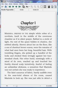
Now it’s time to preview your ebook and run it through its paces with various font faces, font sizes, and different devices.

The previewer does a fairly good job with a nice display. It leads to my biggest gripe with the KC program. I’m a huge proponent of proofreading. With every ebook I format, the author gets a chance to proofread it. The best way to proofread an ebook is to load it up on a device and go through it line by line. That way you can catch not only typos, but errors in formatting, too. If there’s a way to generate a proof file from KC, I can’t find it. (I haven’t gone so far as to try publishing my practice books. I’m assuming clicking “Publish” will take you to KDP.) You can use the previewer for proofreading since you can see the formatting, but with the previewer open you cannot do any editing. So it’s open, close, try to remember where you are, on and on and on. Ridiculous. My best suggestion is to have a markup doc (in Word) open as you go through the text in the previewer. Once done, transfer any changes to the ebook in KC.

What About Images?

Inserting images is easy. Place your cursor where you want the image, right click and select “insert image”. By clicking on the image, a tool pane opens that displays Image Properties. You can kind of size your image, position it and add alternative text.

The images I played with scaled pretty well in the previewer. Keep in mind, any image used in the print file must be at least 300 dpi. For the ebook, 96 dpi is sufficient. (Do not insert your cover! That will cause two covers to be displayed and that’s a seriously rookie mistake.)

What about print?

I haven’t messed around with that yet. So that will be in another post.

My Conclusion

For the self-publisher on a tight budget who intends to use KDP Select, this is a reasonable option. It produces a product that will work properly on any Kindle device or app.

_________________________________________________

So, Dear Readers, does anyone have a book they formatted with Kindle Create they’d like to link to in the comments?


I Finally Did It: WORD FOR THE WISE is now an ebook

I know, I know, I haven’t posted in ages. I’ve been very busy. Anyone want to know how to scan and restore foreign edition paperbacks and turn them into ebooks and print books without being able to understand the words? *crickets* No? Okay, on to the subject at hand.

After years of cleaning and processing MS Word docs, and posting tips and tricks and hacks for using Microsoft Office Word for writing and self-publishing, and answering a lot of emails about problems with Word, I finally compiled that hard-earned knowledge into a book.

2017-11-08_Ebook Cover_Manus_Word for the Wis copy

Here’s an excerpt from the Introduction:

Word is an excellent word processor, one of the most powerful on the market. All that power comes with a price: Where the act of composing fiction or nonfiction is a simple process (in technical terms) Word is complicated. It’s right there in the name itself: Microsoft Office Word. It’s a productivity program for businesses; not a publishing program for writers of commercial fiction and nonfiction.

For writing a report or a business proposal or a policy & procedures manual, it’s one of the best programs around. For writers, though? It’s kind of like driving a Porsche Carrera to the grocery store.

Even so, just about every writer I deal with uses Word. Even Mac users. Even writers who wouldn’t touch a Microsoft program send material that has been exported as a Word doc. Word is everywhere thanks to Microsoft having installed it on all Windows PCs for decades. (They no longer give away the Microsoft Office Suite; Word must now be licensed via subscription.)

Smashwords, the largest and heartiest of the aggregators for self-publishers to distribute and sell ebooks, converts Word docs into a wide variety of ebook platforms. (A publisher can also upload an EPUB file to Smashwords.) Other sites now allow self-publishers to upload Word docs. Even Amazon allows it. The conversion processes they use are programmed to recognize and modify the HTML coding in a Word doc.

Writers are using Word to compose their work, and some use it to format ebooks, and others use it to format print-on-demand editions. Even some professional ebook and print formatters use Word. Word might not be the best word processor for writers, but it is everywhere and it’s not going away for a long, long time.

I have processed thousands of Word docs, millions and millions of words, from hundreds of clients. The majority of those writers are like me from ten years ago, using the program inefficiently and often destructively. Cleaning up those files is how I’ve become an expert.

I can help you use Word like an expert, too.

My goals with this book are:

  • Teach writers to customize Word to suit their particular needs.
  • Teach writers to use the features that actually make their writing lives easier.
  • Help writers increase their creative productivity by eliminating destructive practices.
  • Teach writers to create the various types of docs used for editorial tasks, digital submissions, ebooks and print-on-demand interior files.

Even if you don’t use Word, you might find this book useful. There are dozens of word processors and programs created specifically for creative writing. The majority use the same underlying principles as Word.

I give you my promise. There are no gotchas in this book. No traps. No need for special skills or technical knowledge. I won’t use tech-speak because I don’t know any; I’m talking to you writer to writer. You don’t even need a spectacular memory since many of the things I recommend will require your attention just once. Set it and forget it and write on.

For the time being it’s only available on Amazon. (Have to figure out how to sneak all the mentions of Amazon and Kindle past Apple–heh.) I’m working on the print edition and should have that live in a week or so.

So if you ever wanted to know what I know about using MS Word, now you can, all in one easy guide.

WORD for the Wise:
Using Microsoft Office Word for Creative Writing and Self-Publishing

Working for Readers, Always

QuinnPrincessI signed up for a subscription to Kindle Unlimited. In hopes, no doubt, that it’ll keep me from busting my budget. (Yeah, right.) On the plus side, I’m discovering new authors I greatly enjoy. On the down side, I’m seeing a lot of piss-poorly produced ebooks.

When I’m shelling out the cash POS, I shop carefully, reading samples so I can avoid the formatting atrocities that disrupt my reading pleasure.  With KU, if I read a description that catches my interest, I download it and give it a try. Why not? My money is already in the pot. Have to tell you, my DNF (Did Not Finish) rate is running almost 60%.

To be fair, my DNF rate has always been on the high side. I’m not one of those readers who feels compelled to finish every story I start, no matter how much I pay for it. Either a story grabs me or it doesn’t. No big deal. What’s been frustrating lately is that there have been many stories I would have liked to finish because I liked the plot, ideas and/or characters, but the ebooks themselves are so poorly produced I can’t get past their ugliness to immerse myself in the story.

There you go again, Jaye, being an ebook snob.

Here I can state in all honesty, Not Guilty. It is true, I work very hard to make ebooks as beautiful as I know how. I enjoy the challenge of seeing how far I can push the medium. I try all kinds of tricks and hacks, sometimes just because I can, but usually because I believe they make my ebooks better. Here is something that many of my clients do not realize: Everything I do is for the readers. If a client wants something I know will break the ebook or make it difficult to read, I won’t do it. If the writer insists, they can find another formatter. If I do my job right, no reader will notice what I’ve done behind the scenes. They’ll have read a good book and are happy for it.

What makes me give up on an ebook?

#1: The ebook is broken

The main reason I prefer ebooks over print is because they’re much easier on my eyes. I can adjust the font, font size and line spacing to suit me. When I can’t because the producer was either too ignorant or too lazy to properly format the ebook, DNF. There’s no excuse for this. There is too much information on the internet, too many good tools/programs available — many of them at low or no cost — for anyone to put out an ebook that disables device controls.

#2 Manuscript punctuation

I read for a living. When I’m reading a doc/manuscript, I’m working. When I’m reading for pleasure and the story has manuscript punctuation, my Inner Editor comes roaring out of the shadows, waving her red pen like a sword and puts me to work. I can’t enjoy a story when I’m looking for typos and mentally fixing the text. It also annoys me because it says to me that the Writer Does Not Care enough about my reading pleasure to sell me a finished product. If you don’t know the difference between manuscript punctuation and printer punctuation, then look it up and figure it out. (FYI, one of the first things I do when I’m prepping a client’s text for formatting is I change manuscript punctuation to print punctuation. Always.)

#3 Weird-ass paragraphs

I made it through a whole chapter of an ebook by one of my favorite authors because I like him so much I thought I could tolerate no paragraph indents. Not block paragraphs, with a space between, just everything running together. I couldn’t do it. Book removed from device and that author went back on the check out from the library, if I remember list. I gave up on a fun book last night because of poorly done block paragraphs with double returns between most of the paragraphs, and an occasional indented paragraph. The story is okay and the characters are amusing, and if the weird format weren’t so distracting, I might have kept reading, but it finally tipped me over the annoyance threshold. Paragraphs with super deep indents drive me crazy, too — looks like a manuscript. Super narrow indents are difficult to read. The worst part about weird-ass paragraphs is that it tells me the producer just doesn’t care about my reading pleasure. That makes me far more critical about the text and far more likely to give up on the book altogether.

#4 No proofreading

Regular readers know this is a big deal to me. I encourage every single writer who hires me to either proofread themselves or hire the job out. To further encourage the practice, I do not charge extra to input corrections into the ebook file. As a reader, I KNOW when nobody proofread the ebook. I’m not talking about occasional typos or gremlins that sneak in and get missed. That stuff happens — in print as often as in ebooks. I’m talking about sheer sloppiness, laziness, and yes, disrespect for the readers who pay in money and time. If nothing else, loading an ebook onto a device and proofreading it will tell you if the ebook is broken.

Today’s rant isn’t directed at self-publishers. Overall, trad pubs put out the worst ebooks. It’s directed at everybody. Formatting an ebook isn’t rocket surgery. Anyone with a computer and willingness to learn a few basics can produce one that works properly and doesn’t interfere with the reading experience. Knowing that makes slobby, sloppy, broken, ill-constructed ebooks all the more depressing. It says to me that the creator doesn’t care about the readers. It says they don’t care enough about their own stories to present them in a suitable package.

Let’s do better, people. I’m tired of giving up on otherwise enjoyable books.

Got Workflow? Step by Step to Better Books

Sloth is my deadly sin of choice. But you know what they say, If you want to figure out the fastest, most efficient means of getting a job done, find a lazy person. That’s me. I want to get my work done for the day so I can kick back with a can of Pringles and watch Gordon Ramsay on Hulu.

Producing books for public consumption is not nearly as difficult, complicated or time-consuming as writing them in the first place. Even so, it is a real job (as opposed to an afterthought) and it takes some skill and planning. To do the job right–produce a great product–requires a workflow that makes sense and doesn’t involve anybody’s head exploding. (And please, please don’t come in bragging how you one-step book production by using InDesign or Scrivener to compose your work, then create print and digital and pdf files in one fell swoop. One-size-fits-all might be fast, but it does NOT produce reader-pleasing products.)

I often work with a team–writer, cover artist, editor/s and proofreader. This must be coordinated and everybody has to be kept in the loop and on the same page. I have to make sure everyone has the same tools. (For instance, I do the majority of my work in a text editor and in InDesign, two programs not every writer or editor owns or is familiar with.) Almost everybody has Word–or a word processor that produces .doc files. Anyone with a computer can read a pdf. For that reason, working files used by multiple people are passed around as either .doc or .pdf files.

Taking into account that there will be changes to the text in every step along the way, I prefer starting with the ebook (easy to modify) then use the text that has been edited and proofread to create the print-on-design edition (not so easy to modify).

HOW IT WORKS

Step 1: The Original

workflow1The very first thing I do when I receive a manuscript is create a project folder and do a Save As of the original. Save As is important. There is no reason to NOT make multiple copies of the file. Your computer has plenty of room, and there will be cases when you NEED a previous version. I’ve come up with a file-naming system that helps me keep track of the files. I date the versions, too. My naming system might not make sense to anyone else, so I recommend you come up with something that makes sense to you. As long as it is easy to remember and searchable, it will work.

Step 2: Scan and tag

workflow2I scan through my version of the original .doc file and make styling notes (chapter heads, special formatting). I note hyperlinks and images placement. Then I use Find/Replace to tag italics, bolding and underlining.

Step 3: Clean Up

workflow3I Select All and Copy, then transfer the text into a text editor. Here I do a thorough cleanup which includes finding “illegal” characters, deleting extra spaces, tidying special formatting (italics etc.), and making sure the punctuation is “printer” punctuation and not “manuscript” punctuation. I also start a simple text file that is called “Notes_…” where I jot down the table of contents entries, any special formatting required, and other bits. (If you are doing your own ebook formatting I HIGHLY recommend you not skip the Clean Up step. No matter how good your Word file looks, it’s going to be full of hidden goobers and grabby formatting.)

Step 4: Create a Mark Up Document

workflow4I do a Select All and Copy the clean text and transfer it back into a new Word doc. I style it as a manuscript (Courier font, double-spaced), create a navigation guide (apply the Heading 1 and Heading 2 styles to chapters and sections), and restore special formatting (italics etc.). If I have made styling notes, I highlight those. (This sounds like a lot of work, but it only takes a few minutes.)

Step 5: Format the Proof Ebook

workflow5I do a Save As of my cleaned up text file as an html file. I always ask the writer/publisher what kind of device on which they read ebooks. This tells me whether they need a MOBI file or an EPUB file (they look the same, but the underpinnings are different), and I make that version first.

Step 6: Proofreading

workflow6Sometimes writers hire me to proofread the ebook, sometimes they do it themselves, sometimes they hire a third party. The process is essentially the same: The proofreader goes through the ebook word by word, finding errors, and uses the mark-up document to note changes. Even if I am the proofreader, I send the ebook AND the mark-up document to the writer. That way if they want adjustments to the styling, they can note it on the mark-up document. If there are multiple readers, Word’s Track Changes* is a handy feature. The important aspect is that all changes to the text are clearly noted.

Step 7: Complete the Ebook

workflow7I manually insert all changes/corrections into the html files and finish the ebook/s. I will make the necessary versions a writer needs, and make sure everything is validated and working properly. If by chance you are doing your own ebook and you are using Word, my recommendation is that you have TWO versions of your file: Mark Up and Ebook. Do all your markup and changes in the Mark Up version and transfer it into the Ebook version. That way you won’t “infect” your ebook with Word nasties and extraneous grabby styling.

Step 8: The Smashwords Word File

workflow8Some of my clients use Smashwords. To get the best results with SW, I recommend providing an EPUB file AND a Word file formatted to SW’s specs. What I do is copy the text from the finished ebook into a new file, and strip out the html. (With Find/Replace this takes only minutes) I Select All and Copy the clean, proofread text into a new Word doc. This file is named Final_…. I do a Save As and style the new doc for an ebook. Done.

Step 9: The Print-on-Demand file

workflow9For the Do-It-Yourselfer, you can create a perfectly serviceable and attractive POD book using Word. I happen to use InDesign (because of my innate masochistic tendencies). Either way, the key to a well-produced print version is well organized, squeaky clean text. If you followed my workflow step by step, you just happen to have exactly that on hand. 🙂

I always save the POD version for last. Production takes longer, not only in layout and design, but because it takes time for CreateSpace or Ingrams to approve the files, the cover has to be custom fit, then a proof edition ordered, mailed and gone over. It can take a few weeks. While this is being done, the writer/publisher can already have uploaded and started selling the ebook. If by chance an egregious error is discovered in the text (it happens, sigh…) then it is a relatively painless process to fix the ebook file and upload the new version to distributors. If it happens the other way–that the POD version is finished and distributed**, then an error is discovered during ebook production–well, that error is going to cost time AND money to fix in the POD edition.

The easiest way to pass editing/proofreading notes back and forth for a POD book in production is to use a pdf reader (I use Adobe Acrobat) and make use of the highlight/comment features. If you are using Word to create your POD edition, have your other-than-yourself proofreader read a pdf version and use a Markup document to note changes/corrections rather than having them work on your formatted .doc file. Trust me on this.


As with just about everything in my life, I have to try out many methods before I discover the process that works well for me. More importantly, something that others can use with minimal hassle and instruction. This workflow works. It works whether you are going solo or if you’re working with a team. Try it, you might find your productivity increases.

* A caution–A HUGE CAUTION–about Track Changes. It was designed with print in mind and it’s a brilliant tool. For digital productions it can be a nightmare. If you intend to use a file in which Track Changes was used, clean it thoroughly. As for me, TC never touches any text I intend to format for an ebook.

**I had a client who had a professional design her POD edition, and then needed me to format the ebook. Unfortunately, the only version of edited, proofread text she had was locked up in a QuarkXpress file. It cost her extra for me to recover the text and clean out all the print formatting. A problem she wouldn’t have had if she’d followed my workflow. Save As, people, keep using Save As and maintain your markup files in formats anyone can use.


workflow10Examples are from The Metaphor Deception, by Birch Adams, now available in ebook and print wherever fine books are sold.

Guest Post: Karen Myers–No Need For Calibre

When I ran the recent ebook formatting contest, I noticed some similar issues with many of the entries, all of them the result of Calibre conversion. I have no beef with Calibre, it’s a great online reading platform and I use it myself, but it’s a not-quite-right tool for converting Kindle books. One entrant, Karen Myers (Perkunus Press), contacted me about the problems in her ebook.

KMblog6The flaws weren’t fatal, but Karen was not satisfied with not-quite-right. So I pointed her at Sigil and Paul Salvette’s books, tutorials and website, and now I’ll let her tell you the results:

__________________________

Silly me. I’m an old programmer and I pride myself on trying to get my ebooks “just so”, as if I were writing a piece of code. I want to create worthy offerings to add to humanity’s river of books; at the very least, they should be shiny and well-scrubbed.

So when Jaye offered to judge the formatting of a few books from her blog fans, I hopped right on board, and she was very kind in her review.  But I read with horror things like “squishy line spacing” and links to chapters not working quite as they should, systematically.

I use an EPUB reader and hadn’t seen the book on a Kindle device other than the PC Previewer, so it was useful to see this from the Kindle reader’s perspective, since none of my buyers had complained (yet). Without a Kindle device, I hadn’t realized quite how irritating it was to not properly trigger the “Cover” and “TOC” hard buttons.

Now on the one hand, it wasn’t really broken, but on the other hand, I want perfection in book formatting, and some cosmetic and graphic flourishes. I’m not willing to settle for “good enough,” so Jaye was nice enough to coach me through some of the issues.

(Jaye here: I made a template for Karen based on Paul Salvette’s The Ebook Design and Development Guide)

If you’re content with auto-conversion from EPUB to MOBI or vice versa, or output direct to ebook formats from products like Scrivener, then this is overkill for you and you can stop reading now. But if you want as much control as possible over the results without killing yourself, you might find this approach useful.

Originally I formatted my ebooks in raw HTML using tips from a variety of online recommendations, like Guido Henkel’s. The first book was a real learning curve for me, but after that it wasn’t difficult to just do the same for later books.  Automated search/replace macros took care of things like wrapping lines with <p></p> tags, and so forth.

I took the HTML output, opened it in Calibre, added the cover and converted it to EPUB using Calibre defaults (more or less). I did the same with a separate conversion to MOBI, which required me to maintain a different HTML file because of the way Calibre generates the MOBI TOC. These outputs were what I was uploading to the distributors. The MOBI files produced this way were not ideal, possibly because of AZW vs MOBI choices (in other words, me as a Calibre user, not necessarily Calibre as a tool), and I was left with two files to maintain (EPUB and MOBI) and the Smashwords EPUB as a third file, since my approach wasn’t modular.  So every time I found a typo…

Jaye has taught me a better way… (Sigil)

KM blog1KMblog2I poured my HTML file for a book, broken up into chapters, into a Sigil template.  Each part of my book has a separate file: Beginning Blurb, Title Page, Copyright Page, Also-By-This-Author Page, Small TOC, Chap 1… Chap Last, Guide & Name Index, If-You-Liked-This-Book Page, Excerpt-From-Next-Book Page, Author Bio Page, Long TOC.

KMblog3I have 3 outputs: MOBI, EPUB, Smashwords EPUB. The difference between Mobi and the two EPUBs is that the “stylesheet.css” file is a little different between MOBI and EPUB, and the Cover page is treated differently (EPUBs require an extra step). The difference between my EPUB and my Smashwords EPUB version is that the Copyright Page has different content.

Now, thinking in the long term, I expect that the differences between MOBI output and EPUB output are likely to be persistent, and other devices may come along and generate different optimum stylesheet requirements. So I’m fine with having two different (but very similar) stylesheets which I maintain externally and copy in as needed into the stylesheet.css shell.

Likewise, the fact that Smashwords requires its own ISBN means only that I maintain two different external Copyright Page HTML documents and copy the contents of whichever one I want into the shell in Sigil.

Both of these make use of a simple modular structure.

So, what happens when I finish a new book and want to format it?

PREP

  1. I copy the Sigil file (MOBI version) from the previous book and rename it.
  2. I create Copyright.HTML files for both the normal and Smashwords copyright pages by copying the ones for the last book, renaming them, and updating the content.
  3. I create a new Title page (it’s a graphic) and a new Cover.

KMblog4MAIN CONTENT (MOBI)

  1. I work on the MOBI version first (it’s the master). I copy the text in, chapter by chapter, the front blurb, and the back excerpt.  I run saved searches to wrap the lines with <p></p> tags and to convert special characters to named entities.
  2. I update the Also By and If You Like This book pages by hand.
  3. I run a saved search to update the Title field on all the HTML pages to the new work, and update the equivalent fields in the TOC.NCX and CONTENT.OPF files.
  4. If the book is a little longer or shorter (number of chapters) than the last one, I update the TOC.NCX and CONTENT.OPF files and the HTMLTOC file.
  5. I update the metadata in the TOC.NCX and CONTENT.OPF files. This allows me to do some things that either Calibre doesn’t, or I don’t know how to find, such as set a UUID (Unique User ID) for my short stories that don’t have ISBNs, embed book descriptions, add keywords, etc.  There’s a great tool for this that Jaye told me about:

bb ebooks meta-pad generator (courtesy of Paul Salvette, BB Ebooks Thailand)

KMblog5Run the file through Kindle Previewer (which runs Kindlegen) and check the results.

How much time does this take?  I just updated my entire backlist (3 novels, 5 short stories, 1 story collection) to Sigil–it takes me about an hour for a novel, and 20 minutes for a short story.  Making the short story collection from the already-formatted short story files was truly trivial.

EPUB VARIANT

  1. Substitute the content of the EPUB stylesheet into the stylesheet.css.
  2. Run the Sigil tool to insert the cover.  (Kindlegen does that a different way for MOBI).
  3. For the Smashwords variant, substitute the contents of the Smashwords copyright.html for the default one.

That’s it.  I import the files into Calibre for one last look to make sure they seem healthy, and do a quick scroll through on my EPUB reader. If I find typos, I fix them in the MOBI version (and the Scrivener original) and redo steps (10)-(12).

Why not use Calibre?  I am confused by the various options and clearly, for MOBI conversion, I wasn’t doing it quite right. Also, my original HTML file was one big file with a stylesheet and all chapters together, making modular changes clumsy. Calibre created its own version of the styles it found, and they weren’t always what I expected. It’s a big black box to me, and there were some issues with the results, which may be my fault, not Calibre’s.

Why not use Scrivener?  Like Calibre, you are at the mercy of whatever Scrivener decides to do to instantiate the different conversions. Since the Scrivener text isn’t in HTML, there are all the issues of named entity conversions to deal with, and you have little control over the default styles. The results may be clean, but you can’t do anything special, such as use graphic chapter heads, scene dividers, and so forth, at least not in the Windows version.  Perhaps there’s a way…

Other tools, like Scrivener, will take your word processor input and generate EPUB and MOBI output, but the black box in between what you write and what they produce leaves you at the mercy of the limitations of others, and so your output will remain at best functional vanilla. That’s not a bad thing, but we can do better.

It’s really not that hard to go through the learning curve once.  After that, each new book becomes quite easy.  Your book designers or people like Jaye can help you get started by setting up the first one and explaining how it works.

_____________________________

Jaye again. Thank you, Karen. Now I’d like to add a word about Sigil.

Sigil creates EPUB files. Kindle ebooks are MOBI files converted from EPUB files. So, you can take an EPUB file created in Sigil and convert it with KindleGen into a MOBI file that will work on Kindles.

There’s a gotcha–One size does NOT fit all. EPUB and MOBI handle styling differently. They handle covers differently. If you know what the differences are, you can use Sigil to create ebooks that work exactly how they are supposed to, on EPUB and Mobi. You can control how the devices handle your work, as opposed to being at the mercy of whatever the conversion program decides is best.

I have a special offer for readers of this blog. If you are really serious about creating ebooks that work properly across devices, and you are ready to climb the next step on the learning curve, go buy Paul Salvette’s The Ebook Design and Development Guide. It might freak you out the way it freaked me out when I first read it (I have zero programming experience). If it does, but you’re still motivated, send me an email (jayewmanus at gmail dot com) with a screenshot of your receipt for Paul’s book and I’ll set you up with a template similar to the one I made for Karen.


June Indie Ebook Formatting Award

awardI foolishly thought this would be easy. Entries would consist of a bunch of broken ebooks and maybe there would be one standout to declare the winner. Instead, out of 13 entries, not a single broken ebook and so many standouts I nearly panicked. I had to nitpick on practically a molecular level in order to select a winner.

I did notice a few common problems. One with squishy line spacing, and the other with tables of contents. While all the ebooks responded to the Kindle user controls, ebooks that had been converted using Calibre had squished lines. I’ll address this issue in a later blog post. The other common problem was with the ToC entry not showing up in the Paperwhite Go To feature. I’ll discuss that in another blog post, too.

For now…

The winner is…

picasso problem coverpicasso problem ss1

picasso problem montage

WINNER: The Picasso Problem
Author: Douglas Grant Johnson
Formatter: Douglas Grant Johnson
Size: 661k
“I begin with an html template from Suzanne Fyrie Parrott (Unruly Guides.com), then work in Sigil for the text editing to further modify the CSS and add other html touches such as first line small caps on the first paragraph after a scene change and to get up-caps on the first line of new chapters etc. This gives me an epub file ready for Nook and Kobo, then I use Kindlegen to convert to mobi for uploading to Amazon. So far, I’ve found it best to keep it simple. For example, some html commands work well on the actual Nook, and Kindle hardware, but will not work on the Amazon “look inside”. It seems good to test the job everywhere. I’ve also found it best to forget Calibre.”
TECHNICAL: Perfect.
NAVIGATION: The ToC is not listed in the Go To feature in the Paperwhite. There are multiple links at the beginning and end to give readers opportunities to connect.
EXTRAS: Professional looking front and back matter, including an excerpt for a novel. Good looking listing of other works. Missed an opportunity to offer live links to listings on Amazon.
OVERALL: Attention to detail makes this book a winner. Simple but elegant, and hits all the right notes for a book that looks like a pleasure to read. From the striking little graphics on the chapter heads to spaced ellipses to well-constructed first line treatments, it pulls together in a visually pleasing whole. My only recommendation would be to try pseudo-elements, which work great in Kindle books, and can’t be beat for first line treatments. Excellent job, Doug!

In no particular order, the other entries.

prophet and loss coverTitle: Prophet and Loss
Author: Jon Westcot
Formatter: Jon Westcot
Size: 895k
“Programs used:  Initial layout was done with Sigil.  Paint Shop Pro was used to scale and clean the graphics.  Conversion to Amazon format was done with KindleGen.”
TECHNICAL: Perfect.
NAVIGATION: All links work as they should, and bonus points for linking to the cover artist’s websites.
EXTRAS: Very nice use of an embedded font and graphics for the chapter and section headers. Bonus for the funniest disclaimer in this month’s contest.
OVERALL: This is a beautifully formatted and professionally presented work with nice visual impact in the chapter headings. My only recommendation would be to add color to the graphics so they really pop on the Fire.

prophet and loss ssmost special chosen coverTitle: The Most Special Chosen of All
Author: Rachel Vega
Fomatter:  Rachel Vega
Size: 3715k
“Initial Creation Software:  Sigil
Conversion Software:  Kindle Previewer”
TECHNICAL: Perfect.
NAVIGATION: No ToC listed in the Go To feature on the Paperwhite. Some places in the text have underlined text so it looks like links. But they go nowhere.
EXTRAS: Nice front and back matter, including an author photo. I recommend putting the summary on a page of its own.
OVERALL: While the ebook isn’t unreadable, it’s not quite there. Block paragraphs do not look good in fiction. Use curly quotes instead of straight quotes, and proper em dashes instead of floating en dashes. Do a more careful proofread, including your section titles.
most special chosen ssbone mend coverTitle: Bone-Mend and Salt–Book 1 of Accidental Heretics series
Author: Annie Pearson writing as E.A. Stewart
Formatter: Annie Pearson
Size: 834k
“Word, saved as HTML filtered.
Manually tweak HTML <style> section.
Convert to Mobi via Calibre”
TECHNICAL: Line spacing squishy.
NAVIGATION: No ToC listed in the Go To feature on the Paperwhite. Nice ToC with chapter headings, and interesting section heads. Missed opportunity to have a link (and maybe a thumbnail of the cover) at the end of the preview for another title.
EXTRAS: Curious as to why there is an extra cover included. A nice touch is a short summary at the beginning that gives an overview of the story. Readers with huge TBR piles and poor memories will get the most benefit. A cast of characters separates the fictional from the actual characters. Nice touch.
OVERALL: Overall, a beautifully formatted book that looks great. From a reader’s perspective, very wise move on this author’s part to break up this meaty novel into parts with informative pages at the beginning of each section.
bone mend sskeeping secrets coverTitle: Keeping Secrets
Author: Maggie Dana
Formatter: Maggie Dana
Size: 554k
“Design path: MS Word, to a plain text editor (Text Edit/Mac), to HTML, where I seriously cleaned it up (I spent months and months learning HTML and CSS; Guido Henkel’s site was a huge help, plus I’d already designed my web site in Dreamweaver, so I had a little HTML experience from that. See http://www.maggiedana.com). The first ebook version I did (November 2011) was via Calibre and it worked fine, as did 4 more books in the series. Then a year later I discovered that Amazon was rejecting files created with Calibre, so I bit the bullet and learned SIGIL. I promptly redid all my books with SIGIL OK, that worked great for ePubs and actually passed Apple’s stringent requirements, but what about Mobi? So I downloaded the Kindle Previewer and Kindlegen and produced the Mobi files through that. If there’s a better way, I’d love to learn it (I may beg help from you on this at some point!). So my MOBI path is: MS Word, Text Edit, HTML/CSS, Sigil, Kindle Previewer/Kindlegen…As a print typesetter, I love drop caps, initial caps, and a classy-looking dingbat for a chapter opener. But older Kindles choke on this stuff, so I took off my print designer’s hat and went with a vanilla ebook design.”
TECHNICAL: Perfect
NAVIGATION: The ToC doesn’t show up in the Go To feature on the Paperwhite.
EXTRAS: Clever touch to put a link to the series on the title page.
OVERALL: A nice looking ebook, looks professional throughout. My only recommendation would be to split the page after The End and make an entry in the ToC for “Other Works. I’ll disagree about older Kindles choking on the fancy bits. This book calls out for at least a few. Some graphics in the chapter heads, maybe even a photograph or two of beautiful horses.
keeping secrets ssdeath magic coverTitle: Death and Magic
Author: Steven J. Pemberton
Formatter: Steven J. Pemberton
Size: 605k
“I formatted it myself. I wrote the book in a text editor and used a very simple program I wrote to generate HTML from it, which I then fed into Calibre to produce the .mobi.
(And yes, I read your previous blog post where you said not to use Calibre. Is it a bad idea because of all the cruft that MS Word puts into its HTML export, or is it a bad idea generally? My HTML specifies as little of the formatting as possible, so that – in theory – the reader’s device will use whatever settings the reader has chosen. I wonder if any reading devices allow the reader to override the formatting in the book, to get around really bad formatting? If not, why not? I suppose they shouldn’t encourage writers to think that the reader can fix it himself if he’s not happy with how it looks…)”
TECHNICAL: Squishy line spacing.
NAVIGATION: The ToC doesn’t show up in the Go To feature on the Paperwhite.
EXTRAS: Includes a nice acknowledgements page and About the Author page, along with an excerpt with links.
OVERALL: An attractive, nicely laid out ebook. There’s some ‘lag’ when ‘turning pages’ which indicates a bloated file, even though the file size is not unreasonable. Splitting the files might help. I’d recommend closing up the em dashes–letting them ‘float’ causes odd spacing at times. Other than that, it looks professional.
death magic ssdoc wilde coverTitle: Doc Wilde and the Frogs of Doom
Author: Tim Byrd
Formatter: Gary Chaloner
Size: 7843k
“Formatted by Gary Chaloner using InDesign.”
TECHNICAL: Perfect.
NAVIGATION: No ToC. With 61 chapters and many illustrations, this ebook would have benefited from both a short and long ToC.
EXTRAS: The front and back matter are informative, but I dislike centered blocks of text. It looks amateurish and out of place in an otherwise professional book. Lots of links and an excerpt and sell points. A nice touch to put the Kickstarter appreciation pages in.
OVERALL: This is a good looking book–the illustrations are wonderful! (I would love to see them in color on the Fire) It does have some problems. Drop caps are a good idea in theory, but they just don’t work well across the board. The look kind of okay in the Paperwhite and Fire, but in the Keyboard they are so misaligned they don’t seem part of the text. Also, the first line all-caps are inconsistent. Even though pseudo-elements work inconsistently in EPUB formats, they work great in MOBI files. Use them for first lines and you’ll retain better control over the opening paragraphs. I’d recommend, too, increasing the paragraph indent. I’d also recommend tables for the Kickstarter acknowledgements. Pages of centered names aren’t horrid, but it would look so much better in table format.

doc wilde montage
ranch next door coverTitle: The Ranch Next Door and Other Stories
Author: Elisabeth Grace Foley
Formatter: Elisabeth Grace Foley
Size: 713k
“I did the formatting myself—I created an HTML file in Notepad++ and used Calibre to convert it into multiple formats, following Guido Henkel’s superb online guide.”
TECHNICAL: Line spacing squishy.
NAVIGATION: No ToC listed in the Go To feature in the Paperwhite.
EXTRAS: The front and back matter are nicely done, except for the blocks of centered text in the copyright page and dedication. Live links for the credits would be a nice touch. For the links that are live, don’t list the http part of the url.
OVERALL: Nicely formatted, looks professional and clean.
ranch next door ssstruck by you coverTitle: Struck by You
Author: Marvin Petitjean
Formatter: Marvin Petitjean
Size: 380k
“Name of programs used to format and convert book:
Sigil + Calibre”
TECHNICAL: Line spacing squishy.
NAVIGATION: No ToC listed in the Go To feature in the Paperwhite.
EXTRAS: A three line bit at the end that is more confusing than inviting.
OVERALL: While the text looks clean and professionally written, the impression of this ebook is that of a raw manuscript loaded onto the Kindle for proofreading. Extra wide paragraph indents, lack of scene break indicators, blocks of centered text and not even a The End make the ebook look unfinished. Aside from the fact that the special character used as an ornament in the chapter headings translated inconsistently, using the abbreviation “chptr” looks wrong. My recommendation would be to make more effort to engage readers and take advantage of the emotional connection roused by the story to sell yourself, the author.

struck by you ssthe drowning coverTitle: The Drowning
Author: Richard Herley
Formatter: Richard Herley
Size: 567k
“I formatted it using JEdit (a text editor with really neat XML/HTML tools), then ran it through calibre to make the .mobi. In this I was helped a great deal by Paul Salvette’s How to Format Your eBook.”
TECHNICAL: Squishy line spacing.
NAVIGATION: The ToC doesn’t show up in the Go To feature on the Paperwhite. A very nice ToC, though, so I was a bit disappointed that the terrific chapter titles in the ToC did not appear in the actual chapter heads.
EXTRAS: Nice layout, and an interesting author page. Includes nice synopses and reviews for other works, but missed an opportunity to put links in for those. (Readers do use those!)
OVERALL: A nice looking book, professionally executed. I’d recommend using proper em dashes instead of floating en dashes, which can sometimes look like mistakes instead of punctuation.
the drowning ssto carry horn coverTitle: To Carry the Horn
Author: Karen Myers
Formatter: Karen Myers
Size: 1307k
“I created it from a scrubbed tagged text file (originating in Scrivener) which I converted to HTML using JEDIT following style guidelines from several websites.  I read the HTML file into Calibre and used its conversion plugins (and defaults) to generate the MOBI file. I believe in the “Short TOC in front, long TOC in back” approach.  I thought initial caps, drop caps, etc., starts to chapters would be too prone to breakage and restricted myself to small graphic elements for scene/chapter/end-of-main-text/start-of-marketing dividers.  (Note the echo of the red deer antlers on the text cover page vs the final page of the index). I would greatly appreciate hearing about any outright errors or general design shortcomings you uncover.”
TECHNICAL: Squishy line spacing
NAVIGATION: ++Bonus points for including a short and long ToC, which include links back to the ToC for easy navigation. Minus points for blown formatting when a link is toggled.
EXTRAS: Excellent promotional pages including links on every page, an invitation to sign up for a newsletter, invitation to report errors, an excerpt for another work, a pronunciation guide and other niceties for readers.
OVERALL: A gorgeous book with handsome graphics. Visually, a pleasure. Producers interested in how to include front and back matter in an attractive and inviting way, would do well to study what Myers has done. My suggestion: Use KindleGen to convert the book (and avoid the squishy lines) and fix the links from the ToC to the chapter heads, and this would be a perfectly formatted ebook.
to carry horn montagevoktah coverTitle: Vokhtah
Author: A.C. Flory
Formatter: A.C. Flory
Size: 347k
“I’m very much a DIY author, so although I don’t expect to win, I am hoping to find the areas where the format of my ebook is below standard. Programs : StoryBox 1.5 for the writing and epub/mobi conversion. Calibre to convert .mobi to Kindle compatible file [to check output on my Kindle].”
TECHNICAL: Squishy line spacing.
NAVIGATION: The ToC doesn’t appear in the Go To feature in the Paperwhite. A nice looking ToC though, with chapter titles that avoid the Chap 1, Chap 2, etc. tedium. Unfortunately, the links go to the wrong chapters. In the toc.ncx (the Go To feature) there are listings for “New Documents” and the title is listed as VOKHTAH for Linda.
EXTRAS: A pronunciation guide! A dictionary! Very nice touch for the readers. The thank you page has a link to a webpage spelled out, but it isn’t live.
OVERALL: There are a few extra lines throughout that could be scene breaks or could be mistakes. (if scene breaks, use some kind of indicator; if mistakes, check for extra spaces at the ends of paragraphs) I’d recommend using proper em dashes instead of floating hyphens.
voktah ssyour life ra coverTitle: Your Life With Rheumatoid Arthritis
Author: Lene Andersen
Formatter: David Govoni
Size: 1839k
“We used Scrivener and the standard Amazon Kindle converting program to format and convert the file. The name of the formatter is David Govoni.”
TECHNICAL: Perfect.
NAVIGATION: No ToC listed in the Go To feature in the Paperwhite. No internal links for the endnotes. The ToC has clearly named titles listed. Very important in a non-fiction.
EXTRAS: Credits with live links for editors, cover designers and others. Nice. Blocks of centered text, not so nice. The endnotes are put together well with plenty of links to useful websites. The use of superscript numbers is distracting, though, and makes the text appear misaligned. They do need links because there is no way for readers to reference back to the text. I’d recommend, in the very least, breaking up the endnotes by chapter.
OVERALL: While the book is laid out with solid structure, there are some details that make it look less than professional. Straight quotes instead of curly quotes, no scene break indicators, the paragraph indents border on too narrow, and floating em dashes. The bulleted lists look misaligned.
your life ra ssI want to thank everybody who entered. You put together some terrific looking ebooks and done yourself, and indies everywhere, proud. The BPHs could learn plenty from you.

Click on the covers to see any of the above ebooks at Amazon.

June Indie Ebook Formatting Award

Drum roll, please… Announcing, the very first Indie Ebook Formatting Award!

award

Indie writers, your ebooks are real books. You’ve poured your heart into the writing. You’ve given it the best cover treatment you can.

What about the formatting?

It’s time to find out who’s the best of the best (at least until next month. :D). Maybe this will do for indie ebook formatting what Joel Friedlander’s (The Book Designer) monthly e-Book Cover Design Awards does for indie covers.

Because there is only one of me, I have to put some limits on it. Depending on how this goes, I might be able to open this up more in the future.

THE RULES

  • Kindle ebooks, only. Entries must be submitted as either MOBI or prc files.
  • Only one entry per writer.
  • The ebook must be currently offered for sale on Amazon.
  • The entry must be submitted by the writer. (or in the case of multi-author anthologies, by the editor) The ebook does NOT have to be formatted by the writer.
  • The contest is limited to the first 25 entries (I have to figure out how much time it will take to properly judge this contest, so this rule is subject to change. I will post a notice that submissions are closed if and when I receive 25 entries)
  • Deadline for entries is June 20th, 2013, OR until 25 entries are received, whichever comes first.

How will I judge? Four areas based on the same criteria I use to judge the quality of my own ebooks.

  1. Technical. Does it work? Each entry will be loaded on three Kindles: A Fire tablet, a Paperwhite and a Keyboard. They’ll be run through their paces.
  2. Navigation. I’ll test the internal navigation guides and the producer-generated external navigation guides. This includes internal and external hyperlinks.
  3. Professionalism. Proper use of printer punctuation, layout, structure and attention to detail.
  4. Style and Design. While the above are objective criteria, this is entirely subjective. I’ll be looking for “reader-pleasing” design and innovation.

What does the winner receive? Bragging rights for the formatter, of course. That’s a prize above pearls. The winner will be able to display the award badge on their blog or website. Let the world know YOUR ebook is beautifully formatted.

So what do you think? Proud of your ebook format? Think it’s a winner? Submit your MOBI or prc file and I’ll be the judge.

To Enter the June Indie Ebook Format Award:

  • Send an email to: formatcontest@gmail.com
  • Put June Ebook Formatting Award in the subject line
  • Include a link to your ebook on Amazon
  • Include the name of the formatter (that’s you, if you did it yourself)
  • Tell me what program(s) were used to format and convert your ebook
  • Attach a copy of your ebook file in either MOBI or prc format

An Admonition for Self-Publishers. Ahem…

I’m reading a self-pubbed novel purely for enjoyment (majority of my reading these days is because of work). I want to read it because it is my mostest, favoritest type of fiction, plus the writer is from a place I love to read about. I am motivated.

The writer is making it very hard.

  1. The Kindle book is broken. It’s not a bad break. The user control for line spacing doesn’t work. Problem is (for me) I do most of my pleasure reading late at night. My eyes are tired. I need extra white space on the page.
  2. The styling makes it look like a manuscript, which makes it ugly, which makes me pay even more attention to problem #3.
  3. Lack of proper proofreading. Not that this book is the worst example I’ve seen, but combined with the manuscript-look, every error I stumble across irks me and takes me out of the story.

I will finish this novel. Unfortunately, for the writer, I doubt I will try another of his ebooks.

So, self-publishers, pay attention. This is VERY important. Your writing deserves respect. Start to finish. You write the best you can. You get the best editorial help you can manage. You package the product as best you can. Even if you are on a very tight budget and are doing most of the production work yourself, that’s still no excuse for sloppy work.

Priority: An ebook that works across devices.

If you are using Word to format your ebooks, download the Smashwords Style Guide by Mark Coker. It’s free. Pay close attention to the sections about using style sheets. The ebook you produce will be rather generic, with zero bells and whistles, but if you pay attention, start with a squeaky clean source file, and follow instructions, your ebook will work.

Word-users, print this out and hang it over your computer:

  • NEVER USE TABS, FOR ANYTHING.
  • DO NOT JUSTIFY TEXT.
  • DO NOT USE ANY FONT OTHER THAN TIMES NEW ROMAN OR GARAMOND.
  • DO NOT EVER USE MORE THAN THREE PARAGRAPH RETURNS IN A ROW.
  • DO NOT FIDDLE WITH LEADING AND LINE HEIGHT IN THE BODY TEXT.
  • DO NOT USE SPECIAL CHARACTERS WITHOUT TESTING THEM.

There are some long, involved reasons for that list. All you really need to know is that doing them will break your ebook.

When it is time to convert your ebook, do not save the document as an html file then convert it in Calibre. Please. Stop doing that. That takes all the junk Word piles on then piles on even more junk. Calibre is not the right tool. It will break your ebook.

Some tools that do work: Sigil, MobiPocket, and Kindle Previewer.

Sigil creates EPUB files. There is a learning curve, but the program is fairly intuitive and there is an excellent user guide to walk you through. Caution: Unless you have more than a passing acquaintance with html and css, do not use the EPUB files you make with Sigil to convert into MOBI files for Amazon. There are enough differences in styling that you risk creating a broken ebook.

Amazon will convert Word files when you upload a listing. If, however, you want to view and test your ebook live on a Kindle or other device before you upload, you will need MobiPocket and the Kindle Previewer, which converts your file using KindleGen. I highly recommend viewing and testing. When your Word file is finished, convert it into a prc file in MobiPocket. If there are bad errors, they’ll be caught and you can fix them. You can load the prc file onto your Kindle for live testing. Or you can run it through the KindlePreviewer to make a MOBI file. (Again, do not use Calibre. It’s fine if the ebook is just for you. If you intend to sell it, Calibre is the wrong tool.)

What if you do not have an ereader device? Online previewers are not to be trusted. Find a friend who has a Kindle or Nook and let them test the files. Ask them to toggle all the user controls on and off to see what happens. I do this for friends and friends do it for me (I don’t have a Nook or other EPUB reader). Better you or a friend catches boo-boos before a reader does.

Priority: Readability.

Avoid the “manuscript” look. The best you can hope for, appearance-wise, with a Word format is to basically make it look similar to a mass market paperback. Simple, spare, minimal ornamentation. Go take a look at your book shelves. Simple. Spare. Easy to read.

  • Use printer’s punctuation and use it consistently.
  • Manage the size of the paragraph indents (not too narrow, not too wide, avoid block paragraphs for fiction)
  • Manage your chapter beginnings and scene breaks so readers don’t get confused by what can appear to be random line jumps.
  • Let the machine do the work. Ereaders have user preference controls. Readers have preferences. Make it your goal to interfere with those as little as possible. Figure out how the devices work then format to take advantage of their best features.
  • Proofread. Did I mention your ebook needs to be proofread. I did? Well, I’ll say it again, proofread the ebook. Your pre-production line-editing should have taken care of most of the typos and word choice mistakes, but trust me, no matter how well a work is line-edited, some errors in the text will remain. PLUS, occasionally errors are introduced in the formatting process. It happens. PLUS, hiccups occur in the format itself. If I had to make a choice between paying someone to format and paying someone to proofread, I’d pay the proofreader. It is that important.

If you’re bogged down by production and don’t know what to do next, email me. If I can’t answer your question, I’ll find someone who can. Help is out there. You have to ask. You have to be willing to work on it. If you need motivation, know that there are readers–like me!–who really, really want to read your stories, but will curse the day you were born if your laziness, sloppiness, or carelessness gets in the way of our reading pleasure.


Scene Breaks In Ebooks: Giving Readers A Clue

You fiction writers out there. I bet the majority of you love scene breaks. Dispense with boring transitional passages and maneuvering to shift seamlessly character points of view. Hit a paragraph return or two and start the new scene. I’m sure readers appreciate them, too, seeing as how they don’t have to slog through transitional passages and the writer’s effort to shift POV. (I know I appreciate them)

In printed media scene breaks rarely present a problem–even when the book design doesn’t have actual scene break indicators such as asterisks or graphics. A reader sees an inch of white space on the page and that’s the perfect clue that a shift has occurred. Print book designers can also manipulate the amount of text on a page and lessen the chances that a scene break occurs at the bottom of a page, losing the white space and its visual clue that a new scene has started.

Ebooks don’t work that way. (I’m talking about flowable text and not fixed layout) All too often white space looks like a mistake. There is no way to ensure that the break never occurs at the end of the “page.” If it looks like a mistake or if the scene change seems to happen without any clue, the reader is forced to pause to figure out what is going on. If those stutter-pauses build up it can wreck the reading experience and leave the writer with an unhappy reader who will not buy their next book.

Take a look at the following screen shot. Scene break or mistake?

scenebreak1Kind of hard to tell without a real visual clue, isn’t it? The simplest solution is to use a indicator to make it clear that This Is Not A Formatting Error:

scenebreak2No confusion there.

But, what if the writer doesn’t want scene break indicators? What if asterisks or graphics don’t fit the effect he is going for? A simple and effective method is to drop the first line indent.

scenebreak3There are all sorts of ways to indicate scene breaks. Me, being me, I like the fancy stuff. I often use graphics to add visual interest to the page.

scenebreak4

I do a lot of reading on my Kindles and “text-fatigue” can be a problem. Kind of like driving through Kansas where it seems the landscape never changes.  “Oh look! More cornfields! Zzzzzzz…” I can only assume others feel the same way. Using a graphic mixes it up a bit, gives my eyes a slight change of scenery. It doesn’t take much.

The important thing to consider is that ebooks don’t offer the same visual clue opportunities as print books, so it’s up to you to come up with something so your readers stay in the story rather than in a state of confusion.

Happy New Year, Happy Day: Smashwords Now Accepts EPUB Files

It’s finally happened. Thank you, Mark Coker.

Smashwords Supports EPUB Uploads With Smashwords Direct

“One year ago in my 2011 annual year-in-review here at the Smashwords Blog, we committed to support direct EPUB uploads to the Smashwords platform in the second half of 2012.

Today we fulfilled that commitment with the launch of Smashwords Direct.

This new capability allows our authors and publishers to upload their own professionally formatted EPUB files for sale at the Smashwords store, and for distribution to the Smashwords retail distribution network….”

Read the rest at the Smashwords blog.

What does this mean? Why is this a happy day? A portent of wonderful things to come? At its heart, it means the most important thing:

Stable ebooks

I’ve spent the past year learning how to make stable ebooks. The biggest learning curve lay in figuring out how ebooks work. I’m handicapped because I’m NOT a computer savvy person. I’ve used computers for writing since the 1980s, but quite frankly I’ve used them as glorified typewriters and fancy bookkeeping ledgers with nary a thought about the inner workings or what was going on behind the scenes (behind the screen?). I had to learn a foreign language (html) and figure out who the smart people were so I could learn from them. It’s mostly been trial and error along with plenty of indulgence from some good friends who had enough faith in me to allow me to experiment on their books.

As much as I love the bells and whistles and trying this trick and figuring out that one, the most important lesson I’ve learned is this: If the ebook isn’t stable, none of the fancy stuff matters.

Is it possible for a Do-It-Yourselfer to make a stable ebook with Word? Or Scrivener? Possible, but not probable. Word processors are the wrong tools. You can follow all the directions and be meticulous, but speaking non-tech layperson to non-tech layperson: Shit happens.

A lot of that shit comes from the hardware side of the aisle. Every device maker is dreaming that his device is going to rise as Number One Preferred By Consumers Everywhere. Retailers like Amazon and Apple want their proprietary platforms to be the One Ring That Rules Them All.

With their Meatgrinder conversion program Smashwords struggled mightily to serve a lot of masters, all of them squabbling, and many not playing nice. The goal was to make it possible for anyone to self-publish and get wide distribution. The problem inherent with trying to satisfy everybody, though, is that compromises and narrowing parameters result in an overall lower quality. Ebooks had to be stripped down to the bare bones and great care had to be taken to lessen the chances that shit would happen.

It was backward and upside-down. Here we have increasingly sophisticated ereaders and tablets, full of possibilities that have barely been touched. The wrong tool (Word) makes it too dangerous to attempt exploiting the technology.

In order to reach greater heights, in order to really open up the possibilities, to look under the hood and see what these babies can really do, the ebook must be stable.

A validated EPUB file is stable. When the end user opens their ebook, no matter what the device, it will work. If the user wants to change the line spacing or the font or whatever else their device allows them to do, the ebook will oblige. It will look good on a small screen and it will look good on a big screen. If a user has multiple devices, the ebook will be stable across the devices. The ebook will continue to work even as devices are updated, improved and changed (as long as the devices continue to base them on EPUB–knocking wood here).

What does this mean for the Do-It-Yourselfer? I’m not going to lie. Building a validated EPUB file is NOT the easiest thing in the world. I have heard on good authority that the program called Sigil does a good job and is user-friendly. Having not used it myself, I do not know. Anyone who wants to discuss it, please, feel free.

By opening up Smashwords to EPUB files, my prediction for the New Year is that we’re going to start seeing a serious uptick in the overall quality of ebook formatting. Readers will demand it. They will grow increasingly dissatisfied with bland, generic looking ebooks and unhappy with ebooks that cannot be customized by their devices. We’ll start seeing innovation, too. Right now ebooks are a digital imitation of print. Face it, printed books are just about the perfect medium for conveying text. For that purpose, there’s not much room for improvement. What I’m thinking is how ebooks are different. That’s where the innovations will arise. With a stable platform, a solid foundation from which to build, ebook producers are free to innovate.

So thank you, Mark Coker and Smashwords. I predict your Smashwords Direct publishing option is going to result in benefits far above and beyond whatever it is you envisioned.