First a word about Fair Use. Quotes can enhance your work. Snippets of poetry and song lyrics can add thematically to fiction. But their use can lead writers into areas filled with landmines and legal woes. Trad publishers have experience with the subject and copy editors look for instances that violate Fair Use. Self-publishers need to be aware.
Standford University Libraries have written an excellent guide to Fair Use and permissions. I suggest you familiarize yourself with the subject lest you find yourself on the receiving end of a nasty-gram from an attorney–quite possibly accompanied by a hefty invoice.
So, let’s say you have your legal ducks in a row and would like to insert an epigraph or quote in your ebook, or have a dedication page in the front matter. Here are some tips for making it nice.
IN WORD
Caution, if you use carriage returns and centering in an attempt to “fix” your text on the page, you could end up with unwanted gaps, blank pages or other uglies in the ebook.
Use a style sheet.
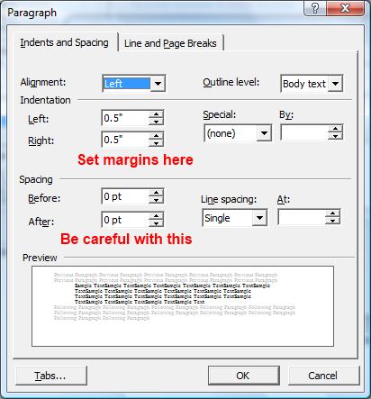
Make a style sheet for your project. Set up your paragraph format like this:
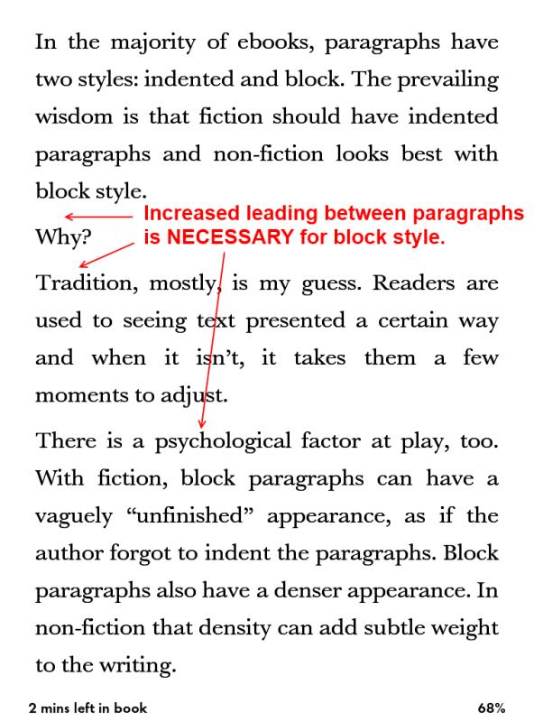
 If this style will only be used for the front matter, I suggest you set a ‘page break before’ in the style sheet. That will place the epigraph on its own page. You can also set the “Spacing: Before” at 12 to 18 pts to drop the text on the page. Don’t get carried away with that, especially if you intend to send this through the Smashwords Meatgrinder. Otherwise, use up to three carriage returns to move the text down.
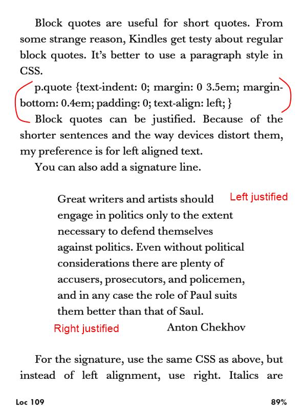
Here is a simple css style class and the html:
 You can adjust the margins to suit your project. Under “margin” the first number controls the top and bottom, and the second is for the left and right. I like to left align short quotes because justification will sometimes stretch and distort the text.
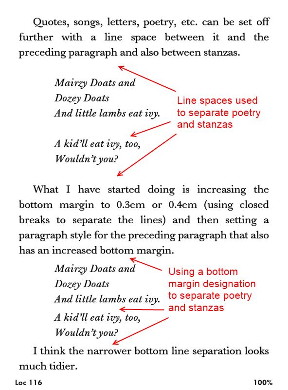
You can use the same stylings for dedications. This styling is also handy for offsetting poetry within the body of the work.
A last word about song lyrics. If you do receive permission to use song lyrics, you will need a permissions notice in your ebook. Put that in the back matter and make sure the artist receives full attribution. Example:
Song lyrics from “Love is an Epigraph” copyright 2013, JW Manus; used with permission granted by the artist.
Now go forth and make your ebook look nice.


