How The Kindle Works

I talk a lot about broken ebooks, but judging from the search terms that bring visitors to this site, I suspect many people do not know what I mean. Part of the confusion is because I am actually talking about Kindle books (and I should make myself clearer, sorry). Since I don’t own a Nook (and have never played with one), or an iPad or iPhone or Sony reader or magic toaster, I tend to judge ebooks by what shows up on my Kindle.

I suspect there are a lot of people who don’t own Kindles. Maybe one or two who’ve never even seen a Kindle.

Here is Amazon’s dirty little secret regarding its Kindle. As long the ebook is converted to either mobi or prc, the Kindle can read it. (I convert raw documents all the time since I prefer reading on my Kindle over manhandling reams of paper–I just run a Word doc through MobiPocket creator and load it up. I’ve done that with pdf files, too.) I don’t call those ebooks. A person who isn’t aware of how a Kindle actually works, might be unaware their ebook is broken–after all, Amazon let them upload it and reported no problems.

Now, the wise formatter will convert their ebook using KindleGen and check their work on the Kindle Previewer. Amazon just updated it and it has more options, include some font changing, so it’s more reliable now. To truly make sure the ebook works, it should be loaded on a device and run through its paces. People who produce a mobi file using Scrivener or convert a file in Caliber or MobiPocket or run a Word doc through the onsite converter at Amazon might end up with a broken ebook and not know it. (A kind reader might take pity and send you an email to let you know your book is broken, or they might return it for a refund, or–worst of all–they might decide your ebook is too unpleasant to read and not buy any more of your books.)

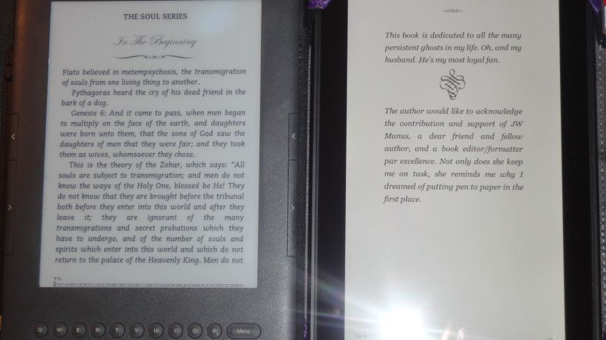
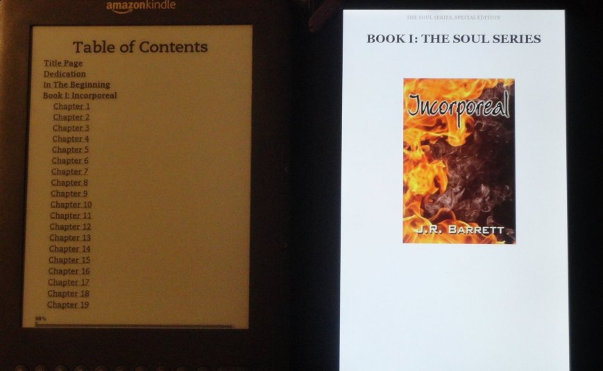
Pardon my less than stellar photography–here is what the menus look like on Kindles.

Kindle MenusThe font sizes are pretty hard to screw up. There was a Kindle-induced bug that shrunk the font, forcing users with older Kindle models to have to greatly increase the font size in order to read. I think that bug was fixed. But I don’t think I’ve ever run into an ebook where the size can’t be changed. The fonts themselves can be changed.

  • Keyboard: “regular” “condensed” and “sans serif.
  • Paperwhite: Baskerville, Caecilia, Caecilia Condensed, Futura, Helvetica and Palatino
  • Fire: Baskerville, Caecilia, Georgia, Palatino, and Helvetica

A common flaw is a locked font (usually in the ugliest choice). After looking at the html in ebooks that have “locked” fonts, I think what is happening is the producer, using a word processor, has defined a font the Kindle doesn’t recognize. So it displays in the closest match. But, since the font is defined, it can’t be changed.

Line spacing is an option on all models of Kindle. It’s a useful one and it’s also a common “break.” When I format a book in html I don’t mess with line spacing. I define the line height so my text isn’t squished, but that’s different than single-space, space-and-a-half and double space. Word has a really nasty habit of inserting a definition for line-spacing into the document that will override the user menu. Sometimes this is deliberate on the producer’s part, sometimes it is inadvertent because that’s just how Word rolls. In any case, it’s undesirable.

Keyboard line spaceAnother common problem is when the margins don’t work. In the older Keyboard model the user can set how many words there are on a line (fewest, fewer and default) and on the Paperwhite and Fire they can set the margins to narrow, normal or wide. Breaks tend to happen when a producer using a word processor, Scrivener or InDesign justifies the text. Why this affects the margins, I don’t know, but it does.

The Fire allows the user to change the background color. White, sepia or black (sorry, Paul, but black? Oh, my eyes!). It’s a nifty feature, but there is a drawback.

AdjustmentsI apologize for the crappy photo, but if you look very closely at the graphic I circled in red you will see a white box around the graphic. For some odd reason Kindle does not recognize that background is transparent. It’s not a huge issue, but one I hope is soon addressed. Something to keep in mind when using graphic elements in your ebook.

Speaking of graphics… Kindles can be read in landscape mode. The Paperwhite requires an ebook that is specifically coded to be read in landscape mode (such as comic panels or a children’s book–unless, there is some command I am too stupid to figure out and am just missing it) The Keyboard can be changed through the menu and the Fire by turning the device.
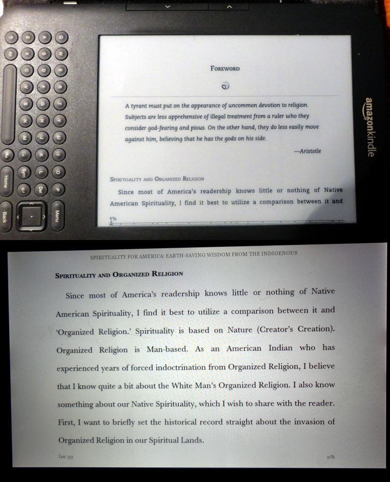
LandscapeLandscape mode can have a significant effect on graphics, especially those that are sized to fit the portrait screen. What I do is size the graphics in percentages so that no matter what size the screen or if the book is being read in landscape mode, it will “shrink” or “expand” to fit the text.

(I was reading a novel that had an interesting block graphic in the header. It looked great in portrait mode, but when I flipped it to landscape suddenly it was just a dumb looking box perched atop the text. Yikes!)

Another common problem is page break failure. The best I can tell (and I’m sure there are those smarter than I who will pop in and set me straight) this is a problem when a producer converts an EPUB file into a mobi file through Caliber. Why Caliber destroys the page breaks is anybody’s guess, but it often does.

So what is the poor ebook producer to do? Especially if you do not have a Kindle on which to test your files? (And this isn’t a slam against people who don’t have Kindles–I don’t have an ereader that uses EPUB files, so I’m playing guess and by golly, too. One advantage with EPUB files is that if my file is validated and I haven’t inserted any weird stuff that could override defaults, I’m fairly certain it will work properly. I’d love it if a Nook owner wrote a guest post about its features and common problems. Any takers?)

  • Download the Kindle Previewer and use it. It’s not perfect and you can’t test ALL the device features, but it will give you a far better display than Caliber or even the previewer at Kindle Direct.
  • If you use a word processor, Scrivener or InDesign be very careful with your style sheets. Do not justify the text. Leave the line spacing at single-space. Don’t get fancy with your margin settings. What YOU see is NOT what the end user will get.
  • Experiment with graphic element sizes and use percentages (when possible) rather than fixed em or pixel sizes.
  • Learn html and get away from using not-quite-right for ebooks programs.

So, now you know what I mean when I say “broken” ebooks. EPUB readers, what are the common problems you find?



Boast Post: A New Way To Make Ebooks

A new way for me anyway. Not long ago I got my hands on Paul Salvette’s book, The eBook Design and Development Guide (link in the sidebar). I talked it up because it explained in plain English (mostly) the hows and whys of building a better ebook. Even though it intimidated me, I knew I had to try his method.

Well…

(Pardon my not using screenshots. I haven’t figured out how to capture screenshots off the Kindle Fire yet. The instructions I’ve seen require a little more… Anyhow.)

As per my usual knuckleheadtude, I picked for my maiden voyage a three-book omnibus. Go bold or go home, right? By the time I figured out I should have chosen an easier project, it was too late and I had no choice except to keep going forward.

This method is NOT for beginners. You need at least some experience with html and text editors. If, however, you are like me, knowing just enough to be dangerous and curious about how ebooks and ereading devices work, going through the steps to build an ebook this way will teach you plenty. I now have a much better understanding about what happens to files when they go through conversion and why some things work better than others and why some things fail.

The biggest difference between what I was doing before and what I did with this book is that before I was formatting the ebook and producing files that could be read on ereaders, but they were not complete ebooks. To make them complete they had to be run through a conversion program. What was missing on my end was a navigation guide and a toc.ncx. Ebooks, I’ve learned, have two tables of contents. The one the formatter creates while formatting and the toc.ncx which is the internal table of contents which is generated during conversion. Conversion also produces a navigation guide which is what makes, for instance, jumping from chapter to chapter possible. Why are there two tables of contents? I do not know. All I know is, I didn’t know how to make them before and I left it up to the conversion programs to do it for me. With this new (to me) method, I built my own navigation guide and toc.ncx. Now, if someone asks me to format a book that they intend to sell on their own site rather than through a distributor, I know how to do it.

What I appreciate most about Paul’s guide (other than being written in language I could understand or figure out–which often takes staring at the screen until, like magic-dot pictures, the answer slowly appears) is that he takes the time to explain what is happening and how things can go right or wrong depending upon which device the book will be read on. That’s valuable information, especially for a non-programmer. I spend a lot of time over on the w3schools.com site seeking answers to my problems, but what’s over there is geared for programmers and people who have skills and experiences that are foreign territory for me. Which means I do a lot of, “hmn, let’s try this and see what happens,” and sometimes I get the desired results and sometimes I don’t. When I can’t get the results I want, it’s a bear figuring out why. I also learned I’ve been making some parts of my formatting tasks overly complicated and much too hard.

As a bonus, on his website, BB eBooks, Paul has an area for developers with templates and guides. It’s a terrific resource.

If you’re like me, you know how to format an ebook, know some html, are comfortable working in a text editor and now you’re ready to kick it up a notch, the guide will take you through the process step-by-step. I recommend you read the entire book first so you get the overall picture of what it is you’re about to attempt. I took a lot of notes and used my whiteboard to help me keep track of such things as bookmarking navigation points and naming files. Since this method involves splitting up the main file into many smaller files, you will need to find a solid, simple way to name the files and keep track of them.

One area where I had serious trouble was in making the zip file. I could not get the recommended program to synch with my computer. That’s not the guide’s fault (I need to get my son over here to figure out why my computer disallows changing directories). So I cheated and copied my files into a .zip folder then changed the .zip designation to .epub. I don’t know if you’re supposed to do that, but it worked. I’m not comfortable with it because my computer sends me nasty grams when I do, but it did work.

Because I was building a book for the Kindle, I had to disregard some of the advice about line spacing. In the most recent update that Amazon did for Kindle devices, they changed the default font and apparently the line spacing and paragraph spacing defaults, too. I’ve noticed in some of the recent stories I’ve downloaded the text appears double-spaced and changing the line spacing on my Kindle takes it down, at the most, to a space and a half between lines. Plus, where before some extra leading between paragraphs made them look better, now the extra leading puts a noticeable gap between paragraphs. I don’t think that is happening on Nooks or other EPUB readers. It didn’t appear to be a problem on Calibre. So pay attention to line spacing when you’re building a book for the Kindle. Things have changed.

I also refrained from reducing the font size anywhere in the book because I don’t know if Amazon fixed the bug that squishes the font in older Kindles. Until I’m sure of that, no font reductions for Kindle.

Some of the touches I did for this book included moving the copyright page and table of contents to the back of the book so potential buyers can get a larger sample. Plus, because it’s a three-book omnibus, I placed a header at the beginning of each chapter with the title of individual book. Just to keep readers reminded of which book they are reading.

I love the way the book turned out. Despite being intimidated by the process, I learned some skills, gained a whole lot of understanding and ended up with a very nice looking ebook that is easy for readers to navigate. (I also learned some new cuss words, but I won’t go into that…)

Thank you, Paul.

If you want to check out my latest masterpiece, and some pretty good stories, too, it’s available now on Amazon.


Since When Do Readers Care About Editing?

Actually, readers have always cared about editing. A well-edited, typo free book is a pleasure to read, and an error-riddled book is not. The real question is, why are readers talking about it now? I’ve never read a book that was 100% error free. Even my beloved old Webster’s 9th has a typo.

It’s not because of self-published books. The books on my Kindle right now are about a 50/50 mix of trad published and self-published. Overall, the self-published books tend to be better produced. When established writers reissue their back lists and are working off scanned conversions or unedited source files, their error rates are about the same as for indie writers starting fresh. Traditional publishers are the worst offenders when it comes to being sloppy.

The only thing new is that readers are actually talking about the editing. I’ve published 17 novels and a bunch of other stuff. I’ve had readers point out errors with my research, but never typos or formatting errors, and trust me, my fair share of those appear in my printed books. Since I’ve put out three ebooks, I’ve had helpful readers point out typos. I’ve always been a freakishly picky reader. Just one of my many quirks. These are normal readers contacting me.

What in the world is going on?

Over on The Passive Voice blog, PG posted an excerpt from an article about the Kindle as “the new medium.” The article by John Dvorak is interesting. The discussion going on in the comments is even more interesting, and that’s where it hit me:

I read differently on a Kindle.
Other readers are reading differently, too.

Last week I tried an experiment. I know I’m fussier when I read on a Kindle, so I used it to proofread a manuscript. Turned out it was just as effective as proofing printed copy and it was easier on my eyes and it went faster.

The Kindle offers a distraction free reading experience.

Think about it. With a printed book all the design elements work to enhance (or if poorly done, detract from) the reading experience. Even the size of the book affects how the book is read. When reading on a computer or even a tablet, the lighting, the colors, the bells and whistles, the knowledge that one is just a click away from a game or a website or a chat with friends are distractions. On the Kindle, with its grey-scale screen, uniform typography, and simple layout, nothing stands between the reader and the words.

I’d been looking at the Kindle’s simplicity as a problem. Now I wonder if it is a strength to exploit and actually enhance the reading experience. It’s something I’m working on.

In the meantime, what does this mean for writers and publishers? It means we need to get on the ball and step up our game. We don’t have fancy papers or layouts or shiny things to hide the goofs. Readers are noticing. Some are complaining–and they should. We owe readers the best product we are capable of producing. What they are buying is the total package–writing, editing, production–and the total package needs to be worth the price they pay and the time they take to read.

If you get an email from a reader who points out typos (or a reviewer complains) just wipe that pouty look off your face, say thank you and fix the problem. We can do that with ebooks. It doesn’t take long at all. If the book in question has been released by a trad publisher, writers, you need to complain. Or better yet, dig up an email address so the reader can complain directly to the person who can and should do something about it.

UPDATE: William shared a link: the People Formerly Known As The Audience. Well worth reading.

Ebook Formatting: Lest They Forget

So, last night daughter-in-law showed me what an ebook looks like on an iPad (I had never played with an iPad before). I suffered a moment of pure, unmitigated envy. The pages were set up to look like printed book pages–including the author’s name and the book title on opposing pages.

I want my Kindle to do that.

You can’t format a header into an ebook. That would really mess things up. The technology is in place for automatic headers, though. When I first open an ebook, the bar across the top shows the book title and author name. As I page into the book, the bar disappears. I wish it wouldn’t because I am terrible with remembering names and titles. I’m not the only one.

My problem is not around the details of the story line specifically, but the name of both the author and the ebook itself, both of which I find I always forget by the time I have read about 10 pages or thereabouts.  I am pretty sure that this is caused by the fact that one misses the reinforcing clues of seeing the cover of any paper book you read every time you pick it up and start reading it.  With an ereader, once you are past the title page, you no longer see the title or author’s name ever again while reading the ebook – Thus unless it is a particular favourite book of yours, there goes the title and writer’s name…

That’s from eBookAnoid in his blog post titled, Do You Remember the Name of the Ebook You Just Finished Reading?

Is this a huge problem? An earth-shattering problem? No, not really. I know it annoys me when I’m reading and realize I have forgotten completely the author name and title, then have to GO TO the beginning or toggle HOME so I can see it on the main screen.

In the reformat I did for Marina Bridge’s Pickers & Pickled Punks, I tried something new:

This is a collection of four short stories. On the title page for each story I inserted a mini-header with the book title and author’s name. (10 pt font, centered) Here’s how it looks on the Kindle.

It’s not nearly as good as having the author and title on every page or every other page, but it’s something. This method would also work on a novel by putting a header at the start of each chapter.

But, here lies danger. Conversion programs such as MobiPocket and Smashword’s Meat Grinder now automatically generate tables of content. This is a good thing since getting the links right can be a pain in the butt. The programs want to use the first line of text on the page after a page break to insert the link in the ToC. With Scrivener this is no problem. I break each chapter/story/section into a file and give the file a name. Scrivener’s ebook generator uses those file names to create the ToC.

Notice how in the ToC I tagged the recipes with “Recipe:” to make them easy to find. In the book itself, I omitted the “Recipe:” and just went with the title.

I haven’t figured out yet how to do this in MS Word. If I were to insert running title/author heads, the conversion program would pick that up for the ToC. I tried doing a manual ToC with links, and that appeared just fine, but then the conversion program generated one, too. Which was very confusing and none too neat, or nifty.

I think it’s worthwhile to figure this out. Discoverability and name recognition are important to indie writers. Every chance we have of locking our names in the readers’ minds has to be a good thing.

My Boast Post: A Beautiful Ebook

I have been dying to write this post all week! I had to hold off until the book was launched.

My charming (and courageous) friend, Julia Barrett had the rights to this novel reverted back to her. She decided to issue it as an ebook. She commissioned a great new cover, courtesy of Winterheart Designs. Previously, I had produced an ebook for another of her books and did a pretty fair job of it. So Julia felt confident I could get the formatting right. But this time would be different. I sez, “I want to make it beautiful. I want it to look as cool as the fancy ebooks I’ve seen.” (here’s where the courageous part comes in) Julia sez, “Okay.”

My goals for this project were: A fancy title page and chapter heads; well laid out bonus material; and text with minimal errors (I really wanted zero errors, but you know how that goes, best laid plans, blah blah blah).

I used Word, Scrivener and Paint.net to produce the file.

Word for proofreading, file stripping and fixing the details like punctuation and spacing issues.

Then over to Scrivener for organizing and layout. This novel includes recipes. (I’m sure I’ve mentioned how I dislike novels that contain recipes. Not sure why they annoy me, but they do, er, did. I now, most humbly, eat my words. Thank you, Julia–you know why, heh) I wanted the recipes laid out so they were useful. (Unlike paper books, my Kindle has proved surprisingly hardy in the kitchen–I like to read while I cook–so I have no problem imagining an e-cookbook) It was the layout, not the vehicle that concerned me. There is plenty of bonus material, too. My goal was to organize it in a pleasing way for readers and make it easy to navigate.

Lastly, I used Paint.net for the graphics.

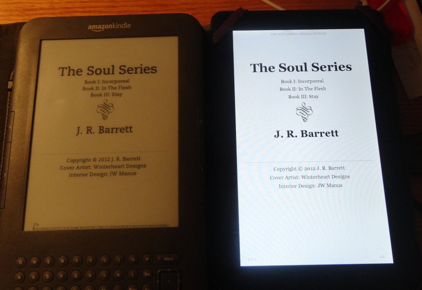
Did I succeed? I think I did. You decide. (my photos aren’t that great–had to angle the camera because of lighting issues–the ebook looks much better in person)

A pretty title page to match the lush, sexy tone of the novel.

Fancy Chapter Heading

Page 2 of the Table of Contents

A recipe that's easy to read

I am not embarrassed to say that when Julia told me the book had uploaded successfully and the preview looked great, I did a Snoopy dance. A beautiful ebook! As nice as I’d imagined. So, yes, this is truly a boast post.

But, tempting as it may be to buy this book just to admire my lovely formatting job, you really should check it out for the story. Beauty and the Feast is charming, sexy and fun. And quite frankly, if imagery had calories, I’d have gained ten pounds just reading the sexy food scenes. (my new favorite genre–food porn) Julia is having a special promotion to go with the launch, so hop on over to Julia’s blog to see what she has in store.